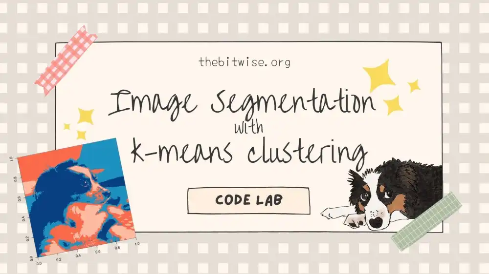
In our last post, we implemented our own k-means clustering algorithm in R! Today, we'll explore k-means clustering some more with a Code Lab to see how we can use the algorithm we coded up last time to cluster pixels in an image!
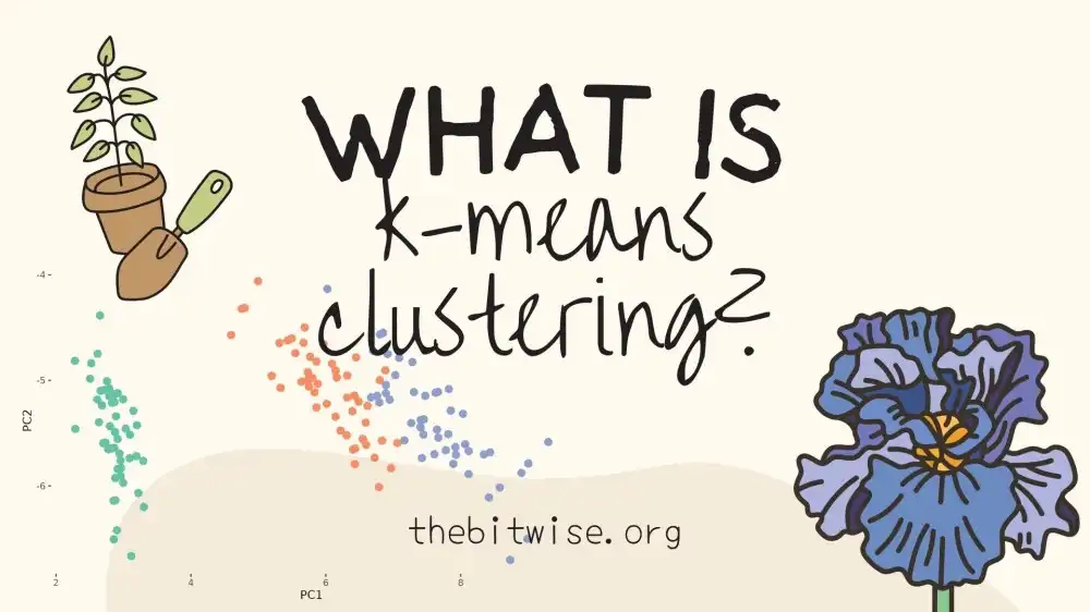
In previous posts, we discussed vectors and vector norms in a basic introduction to linear algebra and got some practice working with them in our Code Lab on coding a simple recommendation system in R. Today, we'll follow up on those skills and take a first look at k-means clustering, a machine learning algorithm for clustering!
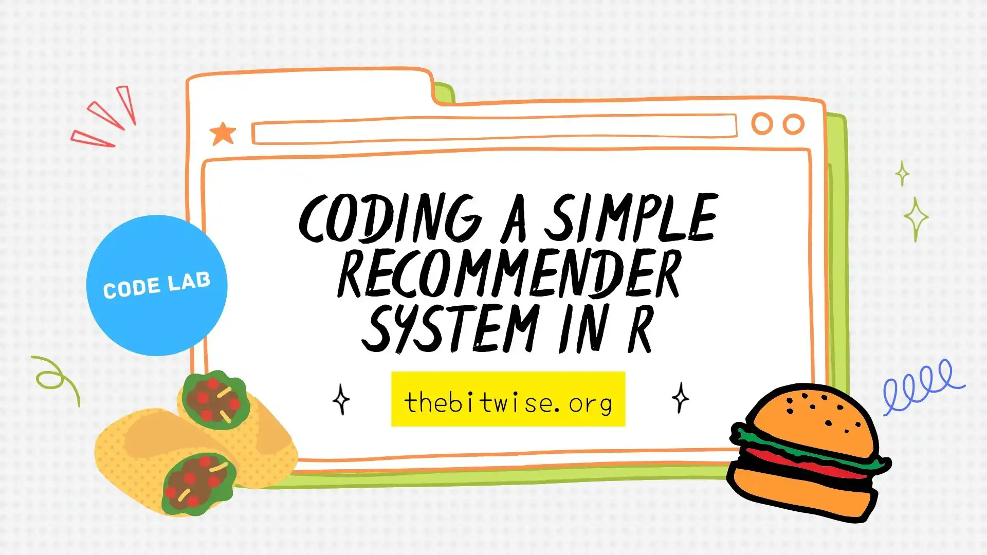
When we shop online, we often get recommendations for other products that are similar to ones we've been looking at. Systems that recommend related products and services are frequently referred to as recommendation systems. In today's Code Lab, we'll code a simple recommendation system using something called cosine similarity!
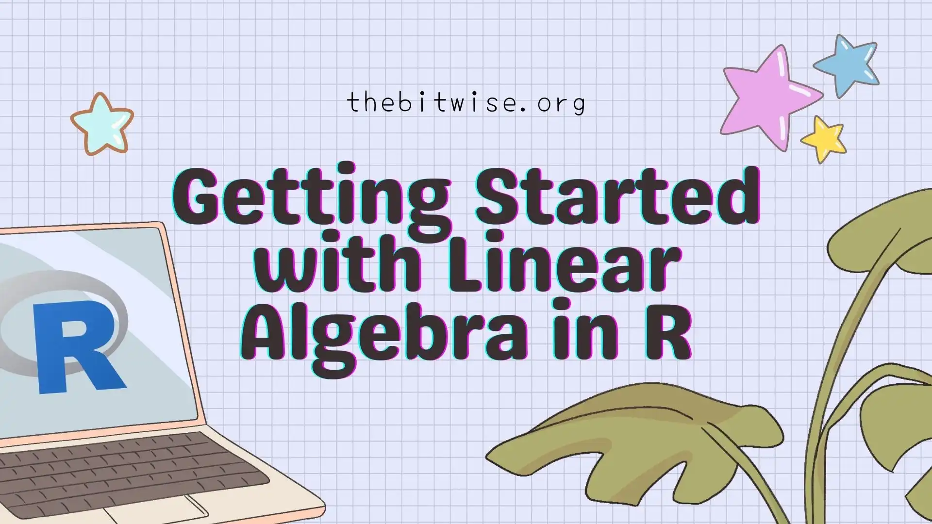
So far, we've been working with single numbers in our posts. Many kinds of data, however, can be represented by matrices. In order to discuss and learn about methods designed for data stored in matrices, today's post is a quick tutorial on getting started with linear algebra in R!
In our first code lab on estimating pi with dart throwing, we talked briefly about algorithms. If you're new to algorithms, we can think of them as recipes, or instructions, for doing or computing something. Today, we'll dive a little deeper into some aspects of algorithms.
In our last two posts, we went over how to start making data visualizations in R with ggplot2. Now that we've finished that series, let's work on a Code Lab featuring exploratory data analysis! Today, we’ll be exploring patterns in urban bike share usage...
In our last post on Getting Started with Data Visualizations in R, we went over how to start using ggplot2 in R. We learned how to set up a basic scatterplot and how to change the colors of the points via a variety of methods. We also learned how to update our plot for categorical variables, and how to add labels, change fonts, and alter the legend.
Have you ever wondered how to make colorful and interesting plots and charts for data visualization? Today’s post is Part 1 of a two-part series on getting started with data visualizations in R! Throughout this tutorial, we’ll be using ggplot2, a very useful R package that we can use to make some really great and professional-looking plots and figures for visualizing data.
In our last post, we approximated the mathematical constant \(\pi\) with simulated dart throwing in R. We also saw that, in general, as we increased the number of darts we threw, our estimate for \(\pi\) generally became more accurate. In this post, we'll see how can we can perform uncertainty quantification with the Central Limit Theorem for our \(\pi\) estimate. We’ll refer to the estimate that we compute for \(\pi\) as \(\hat{\pi}\).
Now that we’ve had several posts on getting started with coding in R (see Part 1, Part 2, and More Resources) we’re ready to get started with our first Code Lab! In this post, we’ll see how we can estimate pi with dart throwing in R!
We just finished a two-part introductory sequence on Getting Started with Coding in R. Today, let's look at some other useful resources for getting started with R. ...
In our previous post on Getting Started with Coding in R (Part 1), we covered how to download and install R and RStudio. In this post, we’ll dive right into coding in R. We’ll do that by quickly building up some skills to complete the following: Write a function to count the total number of heads and tails in a series of coin flips.
In future posts, we'll explore some coding projects here. Before jumping in, we'll start with some basics. This post will be the first of two on getting started with coding in R. ...
When we shop online, we often get recommendations for other products that are similar to ones we've been looking at. Systems that recommend related products and services are frequently referred to as recommendation systems. In today's Code Lab, we'll code a simple recommendation system using something called cosine similarity!
In our last two posts, we went over how to start making data visualizations in R with ggplot2. Now that we've finished that series, let's work on a Code Lab featuring exploratory data analysis! Today, we’ll be exploring patterns in urban bike share usage...
Now that we’ve had several posts on getting started with coding in R (see Part 1, Part 2, and More Resources) we’re ready to get started with our first Code Lab! In this post, we’ll see how we can estimate pi with dart throwing in R!