
Exploring Trends in Urban Bike Share Data
In our last two posts, we went over how to start making data visualizations in R with ggplot2 (Part 1 and Part 2). Now that we've finished that series, let's work on a Code Lab featuring exploratory data analysis! Today, we'll be exploring patterns in urban bike share usage with bike sharing data from Capital Bikeshare in Washington D.C.!
If you're new to R, I have a tutorial on getting started with coding in R in a two-part series here and here. This series will get you up to speed on installing and using R and RStudio so you can follow along with this post.
Bike share data
Let's start by taking a quick look at the documentation for our data! The documentation shows us that the data consists of hourly and daily bike rental data from the Capital Bikeshare system from 2011 to 2012. We'll focus on just the hourly data in this Code Lab.

Ideally, we'd probably prefer to use more recent data, and many bike sharing programs do release raw data to the public. However, these releases typically don't include weather data. Since it would take us some time to scrape our own weather data, we'll use this data since someone has already gone through all the work of merging it with weather data for us.
The Attribute Information section shows us the names of the variables in this data and what they contain. For each hour in a day between 2011 and 2012, we have day, seasonal, and holiday information. We also have weather data for that hour, information on how many bikes were rented in that hour, and how many of those rentals were from casual or registered bike users.
Downloading our data
To use our data, we'll first need to download them and read them into R. We can do this by downloading the source files here from the UCI Machine Learning Repository.
Once we unzip the file, we'll see a file named hour.csv. Let's copy that file to our working directory so we can work with it more easily. To find our current working directory, we can type the following into the R console.
getwd()Don't worry if you're having trouble moving this file to your working directory in R! I'll also have it linked below in case you want to access it that way.
Reading our data into R
Now we're ready to load our data into R! If your hour.csv file is now in your working directory, you can load it in as follows. We'll call this file hourTemp because we'll be making some modifications to it.
hourTemp <- read.csv("hour.csv", sep=",", header=TRUE)If you're not sure if hour.csv is in your working directory, I've also uploaded the file to this site so you can read it into R with the following code snippet.
hourTemp <- read.csv("https://thebitwise.org/data/hour.csv", sep=",", header=TRUE)Looking at our data
Let's take a quick look at our data with the dim() and head() functions. The dim() function tells us the dimension of our data. In this case, it will tell us the number of rows and columns we have in our data. The head() function shows us the first few rows of our data.
dim(hourTemp)
#> [1] 17379    17
head(hourTemp)
#>   instant     dteday season yr mnth hr holiday weekday workingday weathersit
#> 1       1 2011-01-01      1  0    1  0       0       6          0          1
#> 2       2 2011-01-01      1  0    1  1       0       6          0          1
#> 3       3 2011-01-01      1  0    1  2       0       6          0          1
#> 4       4 2011-01-01      1  0    1  3       0       6          0          1
#> 5       5 2011-01-01      1  0    1  4       0       6          0          1
#> 6       6 2011-01-01      1  0    1  5       0       6          0          2
#>   temp  atemp  hum windspeed casual registered cnt
#> 1 0.24 0.2879 0.81    0.0000      3         13  16
#> 2 0.22 0.2727 0.80    0.0000      8         32  40
#> 3 0.22 0.2727 0.80    0.0000      5         27  32
#> 4 0.24 0.2879 0.75    0.0000      3         10  13
#> 5 0.24 0.2879 0.75    0.0000      0          1   1
#> 6 0.24 0.2576 0.75    0.0896      0          1   1
From the dim() output, we see that there are 17,379 rows, or observations, in this data and 17 columns, or variables. From the head() output, we can see that the variable names match the ones we saw under the Attribute Information section on the documentation page.
Each row in hourTemp gives us weather, day, and holiday information for a particular hour of a day during the 2011 to 2012 period. We also get information on the total number of bike rentals during that hour (in the cnt column), as well as how many of those rentals came from casual or registered bike users.
Preparing the data to look at differences between casual and registered users

Since we have data on both casual and registered bike users, let's look at how patterns in bike share usage vary between these two groups! In order to plot bike usage for these two groups separately, we'll split each row in our data into two rows: one for casual users and one for registered users. We'll additionally make a new variable called user to indicate whether the row contains data on casual or registered users.
Making a new dataset with separate rows for casual and registered users
To do this, we'll make new datasets for casual and registered users. We'll call these hour_casual and hour_registered. Both hour_casual and hour_registered will have the same weather and holiday information contained in columns 3 through 14 of hourTemp so we'll extract those columns first.
We can access to any set of rows or columns in our data using brackets [rows, columns] immediately following the dataset name. For example, hourTemp[1,] returns the first row in hourTemp. Similarly, hourTemp[,1] returns the first column in hourTemp. In this case, since we want to take every row of columns 3 through 14, we'll use hourTemp[,3:14].
We can create a new dataset with the assignment <- function. The first line in the code snippet below tells R that we want to make a new object named hour_casual using hourTemp[,3:14].
hour_casual <- hourTemp[,3:14]
hour_registered <- hourTemp[,3:14]
Next, we'll make new count variables in hour_casual and hour_registered using the casual and registered count data from the original hourTemp dataset.
We can make new variables for a dataset by using $ and the new variable name immediately following the dataset name. For example, we can read the first line in the code snippet below as follows: "Make a new variable named count in hour_casual using the data in hourTemp$casual."
We'll also make new user variables to indicate whether the counts for that row come from casual or registered users.
hour_casual$count <- hourTemp$casual
hour_casual$user <- "Casual"

hour_registered$count <- hourTemp$registered
hour_registered$user <- "Registered"
Then, we'll combine these two datasets into a single one for plotting. We'll name this one hour. Since we want R to combine these two datasets by their rows, we'll use the rbind() function.
hour <- rbind(hour_casual, hour_registered)Relabeling weather and season variables

Next, let's relabel some of the weather and season variables so that they're easier to read. The weathersit variable details the weather situation during the hour. From the documentation, it looks like a 1 means that the skies were relatively free of clouds so let's relabel that variable as Clear.
To do that, we'll first use the which() function and the == comparison operator to identify the entries in weathersit that are equal to 1. To read more about these comparison operators, we can type the following into the R console to pull up their documentation.
help("==")This operator will return TRUE if the objects on the left and right of == are exactly equal. It will return FALSE if they are not. If the objects on the left and right are columns from datasets, it will apply the comparison element-wise. Below are two small examples to illustrate how this operator works.
1:5 == c(1,2,3,4,5) # all equal
#> [1] TRUE TRUE TRUE TRUE TRUE
1:5 == c(1,2,3,3,5) # not all equal
#> [1]  TRUE  TRUE  TRUE FALSE  TRUE
If we add the which() function outside of the == comparison, we'll get a list of all the elements that returned TRUE in the comparison. For example, the code snippet below will give us a list of all the entries (stored in weather_1) in weathersit that have a value equal to 1. Then we can use weather_1[1:20] to look at the first 20 entries in this list.
weather_1 <- which(hour$weathersit == 1)
weather_1[1:20]
#>  [1]  1  2  3  4  5  7  8  9 10 11 12 13 41 43 44 45 46 47 48 49
Finally, to rename those entries as Clear, we'll use brackets [] to access the entries in weathersit that are equal to 1. Then we'll relabel those as "Clear".
hour$weathersit[weather_1] <- "Clear"We made a new variable named weather_1 above so that our code is easier to read. However, we can also rename the entries directly without making a new variable as in the example below.
hour$weathersit[which(hour$weathersit == 1)] <- "Clear"Now that we know how to relabel entries, let's relabel the 2 responses as Cloudy. Then the 3 and 4 responses indicate varying levels of stormy weather so let's relabel anything that contains either a 3 or a 4 as Stormy.
hour$weathersit[which(hour$weathersit == 2)] <- "Cloudy"
hour$weathersit[which(hour$weathersit == 3 | hour$weathersit==4)] <- "Stormy"
Similarly, let's relabel the entries in the season variable using the season names.
hour$season[which(hour$season == 1)] <- "Winter"
hour$season[which(hour$season == 2)] <- "Spring"
hour$season[which(hour$season == 3)] <- "Summer"
hour$season[which(hour$season == 4)] <- "Fall"
Finally, R doesn't know how to order these season names. So let's order the responses within these variables so that when we plot the data, the labels will follow a logical ordering. We can do that using the factor() function with a levels() input inside.
The factor() function tells R that this is a categorical variable. The levels() input tells R the ordering that we want for the entries within the factor variable.
hour$season <- factor(hour$season, levels=c("Winter", "Spring", "Summer", "Fall"))
hour$weathersit <- factor(hour$weathersit, levels=c("Clear", "Cloudy", "Stormy"))
We can test to see that these are labeled and ordered correctly using the levels() function.
levels(hour$weathersit)
#> [1] "Clear"  "Cloudy" "Stormy"
levels(hour$season)
#> [1] "Winter" "Spring" "Summer" "Fall"
Preparing other categorical variables
The mnth, hr, holiday, weekday, and workingday variables are also categorical variables but they contain numeric values so R will default to treating them as continuous variables. Rather than specifying them as factors when we plot, let's go ahead and specify that in the dataset so that R knows to treat them as factors.
hour$mnth <- as.factor(hour$mnth)
hour$hr <- as.factor(hour$hr)
hour$holiday <- as.factor(hour$holiday)
hour$weekday <- as.factor(hour$weekday)
hour$workingday <- as.factor(hour$workingday)
We don't need to order these separately since R will default to the numeric ordering in the entries and those are fine for now.
Now we're ready to make some data visualizations! First, we'll need to load the ggplot2 package.
Usage trends by time of day
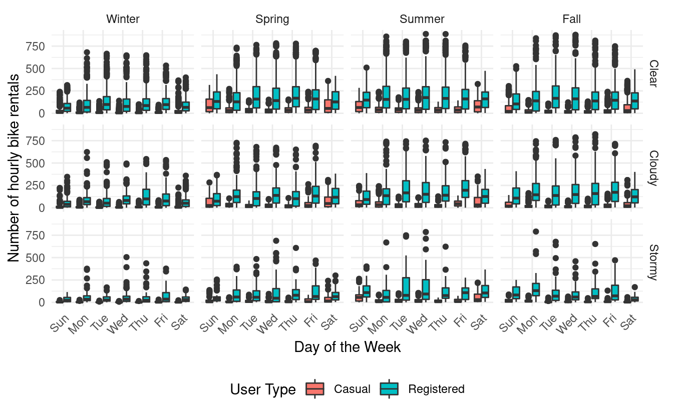
Then, let's start by looking at some overall trends in seasonality, weather situation, and user type based on the time of day. There are many ways we can do that. We'll start by making boxplots of hourly bike rentals by season, weather situation, and user type. We can make separate boxplots for each combination of season and weather situation with a facet_grid() layer.
ggplot(hour, aes(x=hr, y=count, fill=user)) +
  geom_boxplot() +
  facet_grid(weathersit~season) +
  theme_minimal() +
  theme(axis.text.x = element_text(angle = 45, vjust=1, hjust=1),
        legend.position = "bottom") +
  xlab("Hour of Day") +
  ylab("Number of hourly bike rentals") +
  labs(fill = "User Type") +
  scale_x_discrete(breaks=c(3,6,9,12,15,18,21,24))
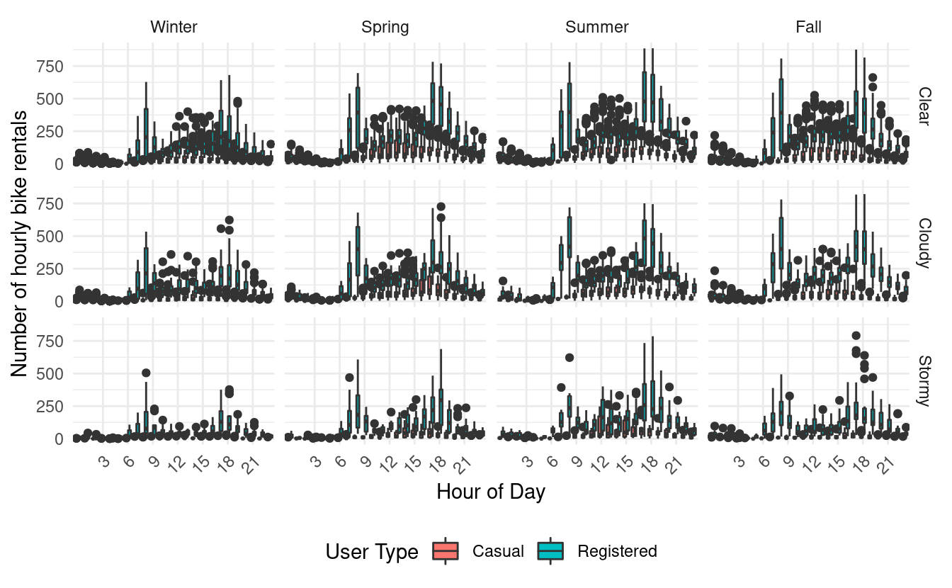
There's a lot going on in these plots because there are 24 hours along the x-axis of every subplot. Additionally, there are two boxplots (one for each of the casual and registered users) for each of those hours! To reduce the number of hour labels appearing on the x-axis, I've used the scale_x_discrete() layer with the breaks input to label only every third hour.
A few trends stand out right away! First, we can see that there are definitely more bike rentals when the weather is clear than when it is stormy.
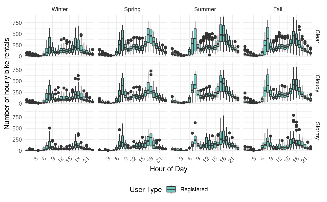
Second, we see that among registered bike users, it looks like there are two times of peak usage during the day. The first is in the morning between 6 am and 9 am, and the second is in the evening between 4 pm and 7 pm. We can see this more clearly when looking at the same plots for just the registered users.
ggplot(hour[which(hour$user=="Registered"),], aes(x=hr, y=count, fill=user)) +
  geom_boxplot() +
  facet_grid(weathersit~season) +
  theme_minimal() +
  theme(axis.text.x = element_text(angle = 45, vjust=1, hjust=1),
        legend.position = "bottom") +
  xlab("Hour of Day") +
  ylab("Number of hourly bike rentals") +
  labs(fill = "User Type") +
  scale_x_discrete(breaks=c(3,6,9,12,15,18,21,24)) +
  scale_fill_manual(values="#71cbc1")
Third, if we look at the same plots for just casual users, we find that they only have one peak in their usage. That peak is quite wide and goes from around 10 am to 9 pm!
ggplot(hour[which(hour$user=="Casual"),], aes(x=hr, y=count, fill=user)) +
  geom_boxplot() +
  facet_grid(weathersit~season) +
  theme_minimal() +
  theme(axis.text.x = element_text(angle = 45, vjust=1, hjust=1),
        legend.position = "bottom") +
  xlab("Hour of Day") +
  ylab("Number of hourly bike rentals") +
  labs(fill = "User Type") +
  scale_x_discrete(breaks=c(3,6,9,12,15,18,21,24)) +
  scale_fill_manual(values="#fe6f5e")
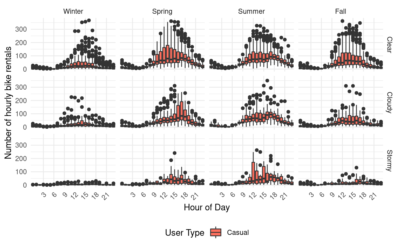
From these plots, it looks like most registered users are using the bikes for some form of commuting. By contrast, casual users seem to rent bikes during midday and evening hours.
Usage trends by month
Next, let's look at some usage trends by month! Since the mnth variable currently contains numbers 1 through 12, let's relabel them so that they show the actual month names. We'll do that using the factor() function with the labels input.
hour$mnth <- factor(hour$mnth, labels=c("Jan", "Feb", "Mar", "Apr",
                                        "May", "Jun", "Jul", "Aug",
                                        "Sep", "Oct", "Nov", "Dec"))
Let's skip the differences in seasons for now and look at just differences in weather situations by user type and month.
ggplot(hour, aes(x=mnth, y=count, fill=user)) +
  geom_boxplot() +
  facet_grid(weathersit~.) +
  theme_minimal() +
  xlab("Month") +
  ylab("Number of hourly bike rentals") +
  labs(fill = "User Type") +
  theme(legend.position = "bottom")

From this plot, we see that there are a lot more hourly bike rentals from registered users than there are from casual ones. We also see that registered bike users seem to rent bikes throughout the year. However, their usage is slightly lower in cloudy and stormy weather and winter months.
Meanwhile, casual users don't rent bikes very frequently during the winter months. We also see that most of their bike rentals occur between March and October.
In the previous figures, we were plotting the number of hourly bike rentals on the y-axis. If we want to see the aggregate number of bike rentals by month, we can also do that using a bar plot. Here, we have to remember to use the stat="identity" input when using the geom_bar() layer. Alternatively, we can also use a geom_col() layer.
ggplot(hour, aes(mnth, count)) +
  geom_bar(stat="identity", aes(fill=user)) +
  facet_grid(weathersit~.) +
  theme_minimal() +
  xlab("Month") +
  ylab("Number of bike rentals") +
  labs(fill = "User Type") +
  theme(legend.position = "bottom") +
  scale_y_continuous(labels = scales::comma)

These bar plots depicting the aggregate bike rentals by month on the y-axis make the differences in number of rentals between weather situations much more apparent. Unsurprisingly, there are very few bike rentals during stormy weather. However, there is also a noticeable drop in bike rentals between clear and cloudy weather. Moreover, this trend holds even for registered bike users, who seem to be renting bikes for their commute.
In the figure above, we added scale_y_continuous() layer with a labels input to avoid the default scientific notation for the tick labels on the y-axis.
Usage trends by month and working day
One variable we haven't looked at yet is the workingday variable. This variable is coded as 0 if the day was a weekend or holiday, and 1 otherwise. Let's relabel this variable to make it easier to read. Again, we'll use the factor() function with the labels input.
Let's see what the data looks like when we plot trends for each month by working day and weather situation for the different user types!
ggplot(hour, aes(x=mnth, y=count, fill=user)) +
  geom_boxplot() +
  facet_grid(weathersit~workingday) +
  theme_minimal() +
  xlab("Month") +
  ylab("Number of hourly bike rentals") +
  labs(fill = "User Type") +
  theme(axis.text.x = element_text(angle = 45, vjust=1, hjust=1),
        legend.position = "bottom")
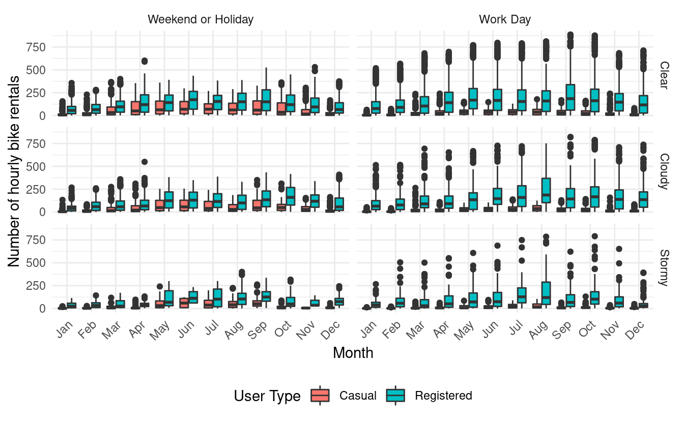
This plot makes it apparent that most of the bike rentals from casual users happen during weekends or holidays. It also shows us that registered users rent bikes throughout the year but they rent a little more frequently on working days. Again, we see that there are far fewer bike rentals during stormy weather and winter months.
Usage trends by day of week
We just looked at some trends by working day status but we can also look at those trends by day of week. Since the weekday variable currently contains numbers 0 through 6, let's relabel them so that they show the actual days of the week. Again, we'll do that using the factor() function with the labels input.
Now let's plot trends by day of week rather than by month.
ggplot(hour, aes(x=weekday, y=count, fill=user)) +
  geom_boxplot() +
  facet_grid(weathersit~season) +
  theme_minimal() +
  xlab("Day of the Week") +
  ylab("Number of hourly bike rentals") +
  labs(fill = "User Type") +
  theme(axis.text.x = element_text(angle = 45, vjust=1, hjust=1),
        legend.position = "bottom")
The trends in these plots mirror the patterns we saw in the plots of month by working day status. We again see that registered users seem to rent bikes throughout the year. Also, with the exception of the winter months and stormy weather, they seem to rent slightly more frequently between Monday and Friday.
Similarly, we also see that casual users tend to rent bikes more frequently on the weekends, particularly in the spring and summer months.
Usage trends by season
We've used facets throughout this Code Lab to look at different slices of the data. Sometimes, it's also useful to subset the data. This means that we look at just the observations in the data that satisfy a particular criteria. For example, we can look at slices of the data for just certain seasons.
Let's try this out and subset hour for the different seasons.
hour_spring <- hour[which(hour$season == "Spring"),]
hour_summer <- hour[which(hour$season == "Summer"),]
hour_winter <- hour[which(hour$season == "Winter"),]
hour_fall <- hour[which(hour$season == "Fall"),]
We haven't looked at the atemp variable yet. This variable reports the normalized value of what the temperature feels like in Celsius. Since the variable has been normalized, its values run from 0 to 1. We can see this by looking at the variable summary.
summary(hour$atemp)
#>    Min. 1st Qu.  Median    Mean 3rd Qu.    Max.
#>  0.0000  0.3333  0.4848  0.4758  0.6212  1.0000
This means that we'll interpret atemp values closer to 0 as cold, and atemp values closer to 1 as hot.
Let's see what we find when we plot a scatterplot of hourly bike rentals by time of day, working day status, and user type for just the spring months. We'll color the points by the normalized feeling temperature so that darker points indicate colder feeling temperatures.
ggplot(hour_spring, aes(x=hr, y=count, color=atemp)) +
  geom_point() +
  facet_grid(user~workingday) +
  theme_minimal() +
  theme(axis.text.x = element_text(angle = 45, vjust=1, hjust=1),
        legend.position = "bottom") +
  xlab("Hour of Day") +
  ylab("Number of hourly bike rentals") +
  scale_x_discrete(breaks=c(3,6,9,12,15,18,21,24)) +
  geom_jitter(width = 0.2, height = 0) +
  labs(color="Normalized feeling temperature in Celsius")
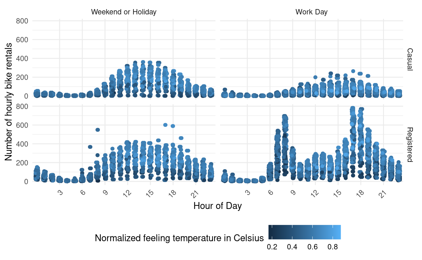
This plot shows shows us that with some exceptions, registered users rent bikes like casual users during weekends and holidays! Not only does the time of day pattern look very similar, but the hourly counts also look very similar during those days.
In the figure above, we added a geom_jitter() layer to allow the points to move a little along on the x-axis. Otherwise, the points would stack up like a straight line above each hour. However, we set the height input to 0 in the geom_jitter() layer so that we don't move the points in the vertical direction and alter the hourly bike counts.
Let's see what we find when we plot the same thing for just winter months!
ggplot(hour_winter, aes(x=hr, y=count, color=atemp)) +
  geom_point() +
  facet_grid(user~workingday) +
  theme_minimal() +
  theme(axis.text.x = element_text(angle = 45, vjust=1, hjust=1),
        legend.position = "bottom") +
  xlab("Hour of Day") +
  ylab("Number of hourly bike rentals") +
  scale_x_discrete(breaks=c(3,6,9,12,15,18,21,24)) +
  geom_jitter(width = 0.2, height = 0) +
  labs(color="Normalized feeling temperature in Celsius")
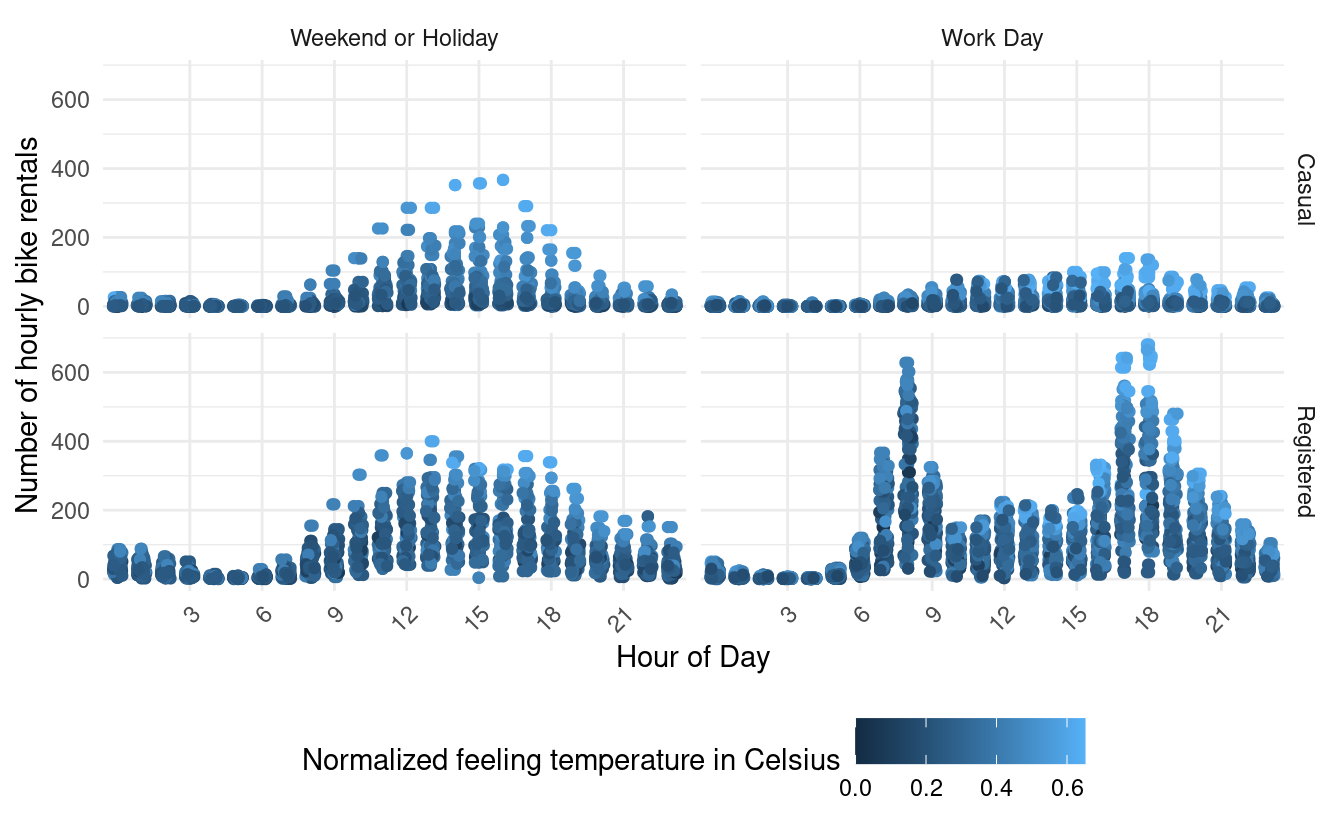
This plot shows us that during the winter months, registered users exhibit similar time of day usage as casual users during weekends and holidays since we see the same single peak pattern. However, registered bike users exhibit much higher hourly counts in colder temperatures (higher counts with dark blue dots). We also see that compared with registered users, casual users rent bikes very infrequently during working days in colder temperatures.
Great job!

In this post, we saw how we can use data visualizations to explore patterns in our data. We also got a lot of practice with using ggplot2, adding layers to modify plot attributes, and using facets to look at different slices of our data. We also got some more experience using external data sources, and we practiced cleaning real data to prepare them for downstream analyses (such as data visualizations). Finally, got a lot of practice applying conditional operations with the which() function and subsetting data. Great job!