
Uncertainty Quantification with the Central Limit Theorem
In our last post, we approximated the mathematical constant \(\pi\) with simulated dart throwing in R. We also saw that, in general, as we increased the number of darts we threw, our estimate for \(\pi\) generally became more accurate. In this post, we'll see how can we can perform uncertainty quantification with the Central Limit Theorem for our \(\pi\) estimate. We’ll refer to the estimate that we compute for \(\pi\) as \(\hat{\pi}\).
This leads us to some interesting and important questions about approximations. Any time we have a method for approximating some quantity, we’ll naturally wonder, “How good were our approximations?” In the context of dart throwing for approximating \(\pi\), we might also ask, “How many darts should we throw to get a good approximation?”

In this post, we’ll begin to answer some of these questions by exploring how we can quantify the uncertainty in our approximations for \(\pi\). To do that, we’ll make use of the way we modeled the random dart throws. We’ll also work our way to exploring and applying a classic theorem from statistics called The Central Limit Theorem.
Let’s get started by taking another look at our random dart throws.
Modeling random dart throws
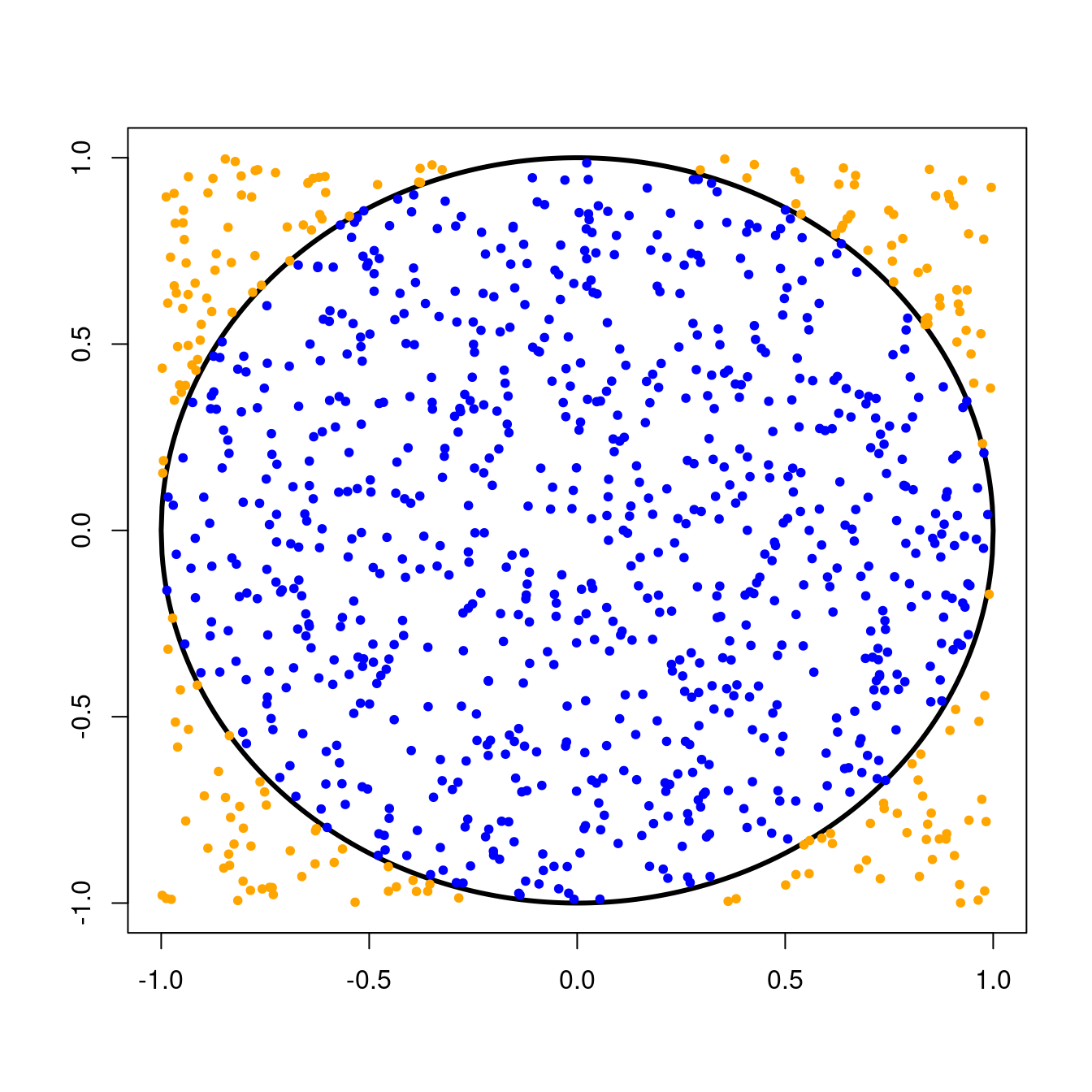
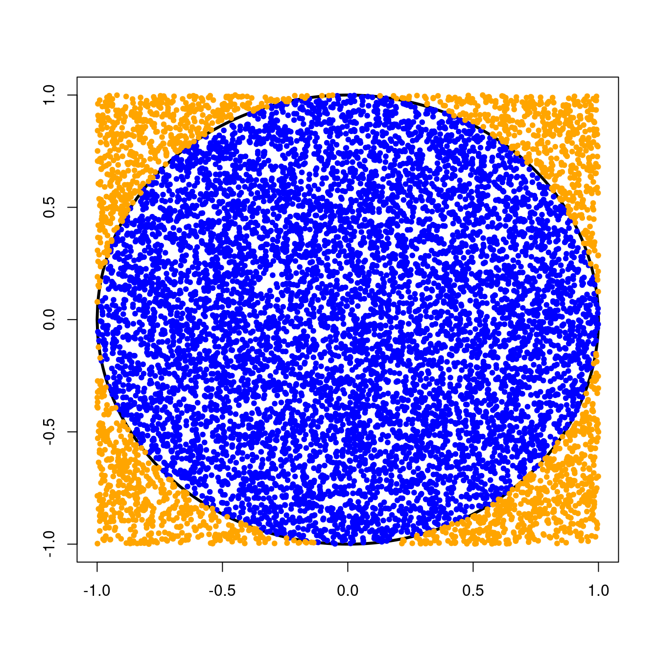
Remember that we threw darts randomly at a circle of radius \(1\) centered at the origin. This circle was inscribed inside a \(2 \times 2\) square, and we kept track of the number times our darts landed inside the circle.Since we were equally likely to throw a dart anywhere in the \(2 \times 2\) square, the probability that a single dart would land in the circle was simply the ratio of the area of the circle to the area of the square, or \[ \text{P}(\text{dart in circle}) = \frac{\text{Area of circle}}{\text{Area of square}} = \frac{\pi r^{2}}{\text{base}^{2}}. \] For our circle with radius \(1\) and \(2 \times 2\) square, we can compute this probability as \[ \text{P}(\text{dart in circle}) = \frac{\pi \times 1^{2}}{4} = \frac{\pi}{4} \approx 0.79. \]
Independent binomial random variables
It turns out that we can model this experiment of random dart throws involving two outcomes (in the circle or not) as a binomial random variable. This is the same model we would use for experiments involving random independent coin flips. Independence here means that the outcome of each coin flip is not affected by the outcome of any other coin flip.
For a fair coin flip, the probability of success (say, flipping a head) would be \(0.5\) since you would be equally likely to flip a head or a tail. In the case of our random dart throws, “success” occurs when a dart lands in the circle and the probability of that, as we saw above, is \(\frac{\pi}{4}\).
To try this in R, we can use the rbinom function. Remember that if you want to read more about this function from his documentation, you can type ?rbinom into your R console.
From the documentation, we see that the rbinom function takes in three inputs. The first is n, or the number of darts we want to throw at once. The second is size, or the number of times we want to throw each dart. The third is p, the probability that a dart lands in the circle.
In our case, we want to throw one dart at a time so we will set n = 1. We want to repeat this experiment many times, so let’s start with size = 1000. Finally, our probability of landing in the circle is p = pi/4.
Sums and averages of random variables are also random
Notice that if we do this multiple times with different seeds, we’ll end up with different numbers of darts that landed in the circle. (Note: We went over writing for loops and using random seeds for reproducibility in the previous post.)
# Run 5 experiments
darts <- numeric(length=5)
for (a in 1:5) {
  set.seed(a)
  darts[a] <- rbinom(n=1, size=1000, p=pi/4)
}

# Number of darts in the circle in each experiment
darts
#> [1] 785 796 799 764 795
Above, we repeat this experiment of (1000) darts five times with different starting seeds and get five different sums back: 785, 796, 799, 764, 795. This is because our dart throws are random, so their sum is also random.
Computing \(\hat{\pi}\), the \(\pi\) estimate
In order to arrive at our estimate for \(\pi\), we did the following. After counting the number of darts that landed in the circle, we had to divide this by the total number of darts we threw, and then scale this number by 4.

This gives us the proportion of darts that land in the circle and it is also a scaled average. Unsurprisingly, this scaled average is also random. By this, we mean that if you repeat this experiment multiple times and take the scaled average number of darts landing in the circle each time, you will probably get different numbers.
# Run 5 experiments
darts <- numeric(length=5)
for (a in 1:5) {
  set.seed(a)
  darts[a] <- rbinom(n=1, size=1000, p=pi/4)
}

# Estimate for pi
pihat <- 4*darts/1000
pihat
#> [1] 3.140 3.184 3.196 3.056 3.180
Above, we see that we computed \(5\) different \(\hat{\pi}\) and got five different numbers: \(3.140\), \(3.184\), \(3.196\), \(3.056\), and \(3.180\).
Sums and averages of random variables are special!
To see a very special property of sums and averages of random variables, let’s back up a bit from the scaled averages and look just at the proportion of darts that land in the circle. We’ll repeat our experiment 100 times and plot a histogram of average number of darts that land in the circle.
You can use the hist function in R to plot histograms of data. What do you think this histogram will look like?
# Run 100 experiments
darts <- numeric(length=100)
trials <- 1000
for (a in 1:length(darts)) {
  set.seed(a)
  darts[a] <- rbinom(n=1, size=trials, p=pi/4)
}

# Average number of darts that land in the circle
avgDarts <- darts/trials

# Plot histogram of averages
hist(avgDarts, freq=F, main="",
     xlab = paste("Average number of darts in the circle"))
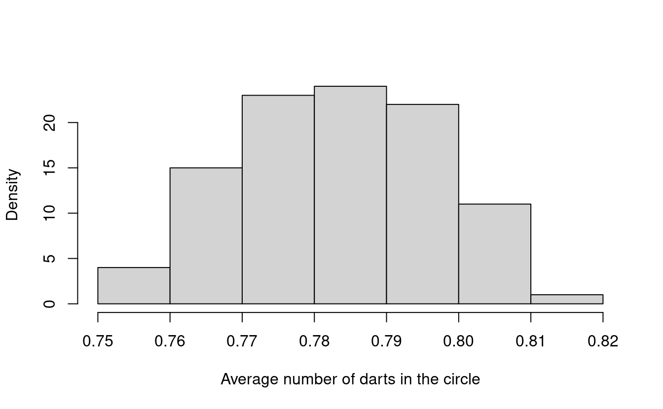
What do you notice about this histogram? Do you remember what our original probability of success was? Let’s put it into R and see what it is. In R, you can just type pi in the console for the mathematical constant \(\pi\).
pi/4
#> [1] 0.7853982
It looks like a lot of the darts end up close to \(0.785\)! Were you expecting this?
Let’s try repeating this experiment again 5000 times. What do you think this histogram will look like?
# Run 5000 experiments
darts <- numeric(length=5000)
trials <- 1000
for (a in 1:length(darts)) {
  set.seed(a)
  darts[a] <- rbinom(n=1, size=trials, p=pi/4)
}

# Average number of darts in each experiment
avgDarts <- darts/trials

# Plot histogram of averages
hist(avgDarts, freq=F, main="",
     xlab = paste("Average number of darts in circle"))
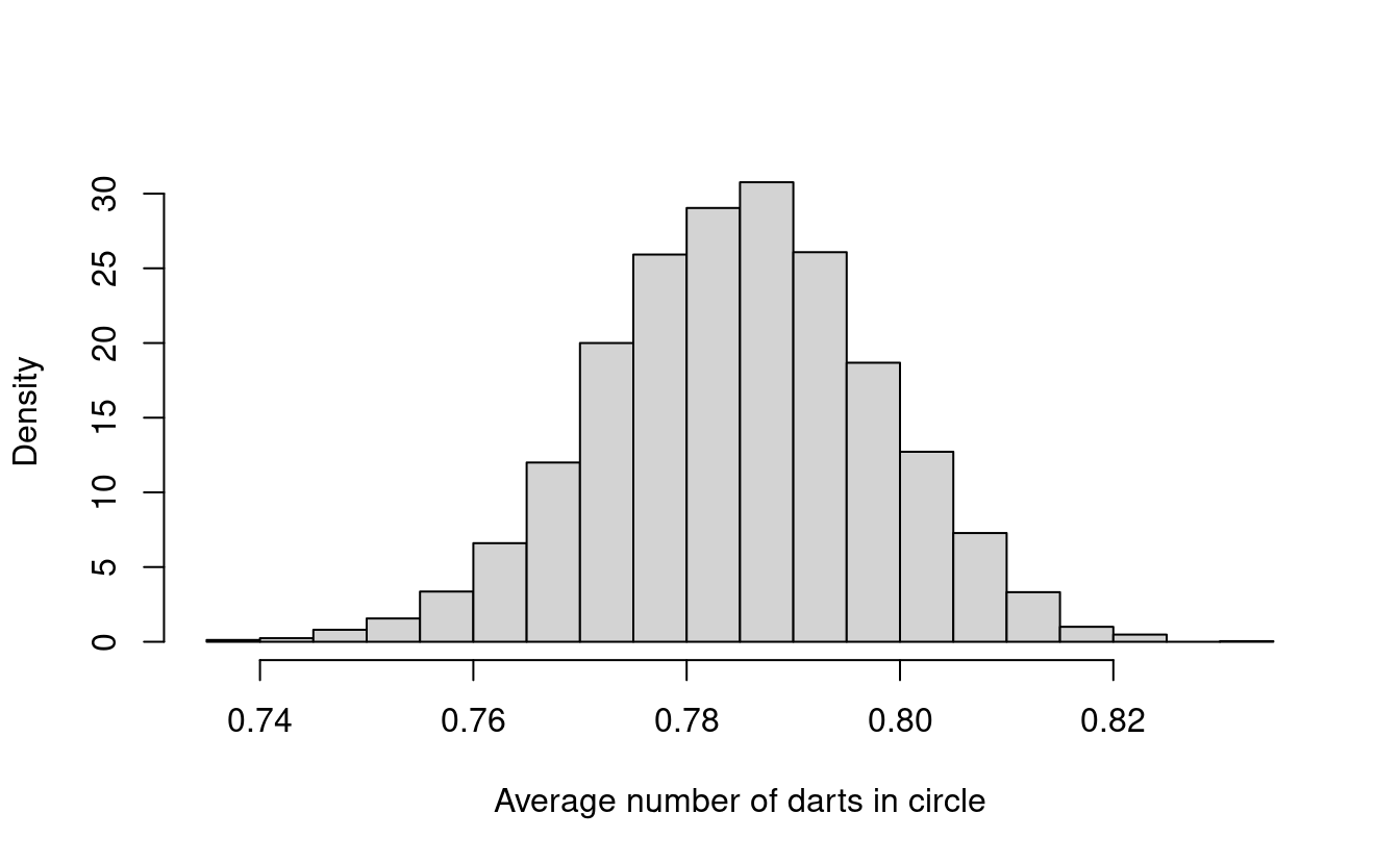
Does this histogram look familiar to you? In fact, its shape looks a lot like the density for a normal distribution!
Normal random variables
A normal random variable is one whose distribution looks like the well-known “bell curve.” The distribution is determined by two components, which we refer to as parameters. The first is the mean, or average. This dictates the center of the bell curve. The second is the variance, which dictates the spread, or the width of the bell curve. In the normal distribution, the bulk of the bell curve lies within approximately \(2\) times the square root of the variance.
Let’s overlay the density of the corresponding normal distribution over this histogram. To do that, we’ll compute the mean and standard deviation (square root of the variance) of the avgDarts from our experiments. In R, we can do that using the mean and sd functions.
# Plot histogram of averages
hist(avgDarts, freq=F, main="",
     xlab = paste("Average number of darts in circle"))

# Plot normal density using mean and sd from avgDarts
lines(seq(min(avgDarts), max(avgDarts), length=40),
      dnorm(seq(min(avgDarts), max(avgDarts), length=40),
      mean(avgDarts), sd(avgDarts)), col="orange", lwd=2)

The orange line shows the normal density that we get when using the mean and standard deviation from our avgDarts experiments. Our histogram looks a lot like the normal density!
Standardizing our \(\pi\) estimate
Now, let’s see what happens when we standardize our avgDarts data. This means that we’ll take every number in avgDarts and subtract off the mean and then divide by the standard deviation.
After we standardize our data, we’ll plot the histogram again and overlay it with the standard normal density. The standard normal density is the normal density with mean equal to \(0\) and variance equal to \(1\).
# Standardize data in avgDarts
avgDarts.mean <- mean(avgDarts)
avgDarts.sd <- sd(avgDarts)
stdAvgDarts <- (avgDarts - avgDarts.mean)/avgDarts.sd

# Plot histogram in stdAvgDarts
hist(stdAvgDarts, freq=F, main="",
     xlab="Average darts in circle (standardized)")

# Plot standard normal density with mean 0 and sd 1
lines(seq(min(stdAvgDarts), max(stdAvgDarts), length=40),
      dnorm(seq(min(stdAvgDarts), max(stdAvgDarts),
                length=40), 0, 1), col="blue", lwd=2)
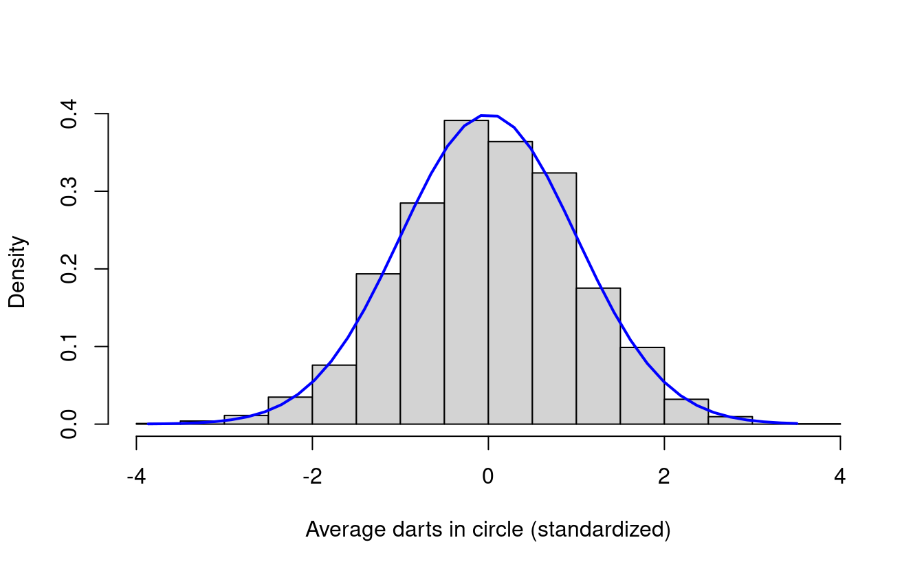
Now we see that the histogram for our standardized data looks a lot like the standard normal density! What do we mean by this? First, it has the familiar bell curve shape from the normal distribution. Second, the histogram of the standardized data looks like it’s centered around zero. This is because we subtracted off the mean from every number in our data. Finally, the bulk of the histogram data lies between \(-2\) and \(2\).
Histograms of \(\hat{\pi}\)
We can do the same thing with estimates for \(\pi\). First, we’ll scale avgDarts by \(4\) to get \(\hat{\pi}\). Let’s plot the histogram of these first.
# Compute pi estimates
pihat <- 4 * avgDarts
hist(pihat, freq=F, main="", xlab=expression(hat(pi)))
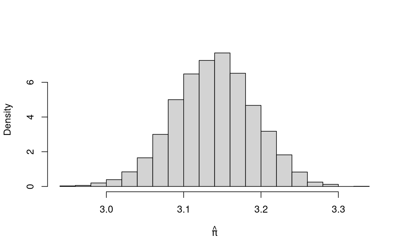
The histogram for pihat also has the shape of the normal density! In fact, the histogram for pihat looks just like the histogram for avgDarts. That’s because pihat is just a scaled version of avgDarts (we multiplied avgDarts by 4 to get pihat).

What happens if we standardize our \(\hat{\pi}\) values and plot that histogram? What do you think we’ll see?
# Standardize pi estimates
pihat.mean <- mean(pihat)
pihat.sd <- sd(pihat)
stdPihat <- (pihat - pihat.mean)/pihat.sd

# Plot histogram in stdEstPi
hist(stdPihat, freq=F, main="",
     xlab=expression(paste(hat(pi)," (standardized)")))

# Plot standard normal density with mean 0 and sd 1
lines(seq(min(stdPihat), max(stdPihat), length=40),
      dnorm(seq(min(stdPihat), max(stdPihat),
                length=40), 0, 1), col="magenta", lwd=2)
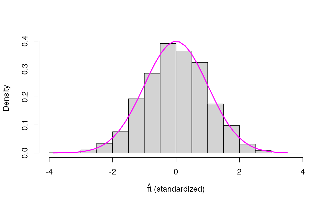
Is this what you expected? The standardized \(\hat{\pi}\) values look like the standard normal density!
It turns out that this is a special property of sums and averages of independent random variables. This well-known result has been formalized in what’s known as the Central Limit Theorem.
What’s the Central Limit Theorem?

The first version of what’s now known as the Central Limit Theorem dates back to Pierre-Simon Laplace’s work in 1810 (see Section 1.2 of “A History of the Central Limit Theorem: From Classical to Modern Probability Theory” by Hans Fischer). There’s even a whole text with several hundred pages on the History of the Central Limit Theorem so there has been a lot of work done on this, and there are now several versions of the Central Limit Theorem.
In the version that we’ll use here, the Central Limit Theorem basically says the following.
Let \(X_{1}, X_{2}, X_{3}, \dots, X_{n}\) be \(n\) independent identically distributed random variables with mean \(\mu\) and variance \(\sigma^{2}\). Then their mean \(\bar{X}\) behaves like a normal random variable with mean \(\mu\) and variance \(\frac{\sigma^{2}}{n}\) as \(n\) grows very large. This pattern holds regardless of the original distribution of the random variables.This is exactly what we saw when we made our histograms for \(\hat{\pi}\) estimates earlier!
Bernoulli random variables
Each number we got when we ran the \(5000\) experiments was a scaled average of \(n=1000\) independent, identically distributed Bernoulli random variables. (Note: A Bernoulli trial describes an experiment with two outcomes, such as a single coin flip. We use binomial random variables to model the number of successes in \(n\) independent Bernoulli trials, such as \(n\) independent coin flips.)
Remember that independence here means that the outcome of each dart throw is not affected by the outcome of any other dart throw. Identically distributed means that the numbers in each of the \(1000\) trials in a single experiment all come from the same distribution and share the same distribution parameters. In our case, each of the \(1000\) dart throws in a single experiment comes from a Bernoulli trial with probability of landing in the circle equal to \(\frac{\pi}{4}\).
We’ll abbreviate independent identically distributed as iid from now on.

When we plotted the numbers we got from the various sets of \(5000\) experiments on a histogram, we saw that their frequencies looked like the normal density. This pattern held for the sums (total number of darts in the circle) of the \(1000\) trials as well as their averages (average number of darts in the circle) and scaled averages, or our estimates for \(\pi\).
What does the Central Limit Theorem have to do with our dart throws?
Since our \(\hat{\pi}\) are scaled averages of iid random variables, we can apply the Central Limit Theorem to get a confidence interval for any single \(\hat{\pi}\) with \[ \text{CI}(\hat{\pi}) = \hat{\pi} \pm 1.96 \times \text{se}(\hat{\pi}). \] Here, se refers to the standard error, which is given by \(\text{se}(\hat{\pi}) = \text{sd}(\hat{\pi}) \). In general, the standard error is the standard deviation (square root of the variance) of our estimator (in this case, \(\hat{\pi}\) ).
We’ll begin by computing a single \(\hat{\pi}\) for different numbers of trials. While we do this, we’ll also compute the standard error for each estimate. Let’s do this for \(n = 100, 1000\), and \(10{,}000\) trials.
# Function for estimating pi experiments
estimatePi <- function(experiments=1, trials=1000) {

  # Throw darts at circle
  darts <- numeric(length=experiments)
  for (a in 1:length(darts)) {
    set.seed(a)
    darts[a] <- rbinom(n=1, size=trials, p=pi/4)
  }

  # Compute pi estimate
  pihat <- 4*darts/trials

  # Compute standard error estimate
  se <- numeric(length=experiments)
  for (b in 1:length(darts)) {
    seVec <- numeric(length=trials)
    seVec[1:darts[b]] <- 4
    se[b] <- sd(seVec)/sqrt(trials)
  }

  return(list(pihat=pihat, se=se))
}

# Run experiments with different number of trials
n100 <- estimatePi(trials=100)
n1000 <- estimatePi(trials=1000)
n10000 <- estimatePi(trials=10000)
Next, we’ll extract the \(\hat{\pi}\) and the standard errors from each of our experiments. We’ll use these to construct a confidence interval for each \(\hat{\pi}\).
# Get means of the experiments
results.pihat <- c(n100$pihat, n1000$pihat, n10000$pihat)
results.pihat
#> [1] 3.240 3.140 3.142

# Get standard errors of experiments
results.se <- c(n100$se, n1000$se, n10000$se)
results.se
#> [1] 0.15771090 0.05199138 0.01641982

# Compute CI lower bounds
results.lower <- results.pihat - 1.96 * results.se
results.lower
#> [1] 2.930887 3.038097 3.109817

# Compute CI upper bounds
results.upper <- results.pihat + 1.96 * results.se
results.upper
#> [1] 3.549113 3.241903 3.174183
Finally, we’ll plot each \(\hat{\pi}\) with its confidence interval.
# Combine results and confidence intervals in data frame
results2 <- data.frame(results.pihat, results.se,
                       results.lower, results.upper,
                       c("100", "1k", "10k"))
colnames(results2) <- c("pihat", "se", "lower",
                        "upper", "n")
results2$n <- factor(results2$n,
                    levels=c("100", "1k", "10k"))

# Load ggplot2 library
library(ggplot2)

# Plot 95th percentile confidence intervals
ggplot(results2, aes(x=n, y=pihat)) + geom_point() +
  geom_errorbar(aes(ymin = lower, ymax = upper, colour=n)) +
  xlab("Number of trials (n)") +
  ylab(expression(paste("Average value of ",hat(pi)))) +
  geom_abline(intercept=pi, slope=0, linetype=2,
              color="black") +
  theme(panel.background = element_blank())
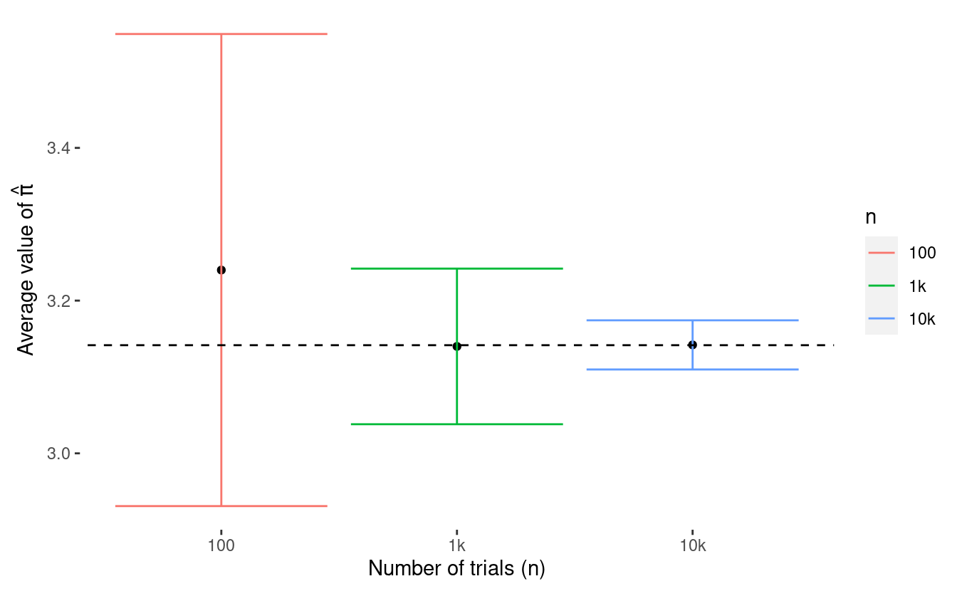
In this example, we see that as we increase the number of trials, we get a tighter (or more narrow) confidence interval for \(\hat{\pi}\). This looks like a good thing, right? But how exactly do we interpret these confidence intervals?
What is a confidence interval?
We get a 95th percentile confidence interval around something we estimate, such as \(\hat{\pi}\) and we interpret it in the following way.
If we were to repeat our procedure for estimating \(\hat{\pi}\) and constructing its confidence interval many times, 95 percent of time, the confidence intervals should cover the true value of \(\pi\).We can test whether or not the normality approximation (and its corresponding confidence interval) was good by testing the coverage of our confidence intervals. We do this by repeating our procedure for estimating \(\hat{\pi}\) and constructing its confidence interval many times, say with \(5000\) experiments. For each of these \(5000\) times, we’ll record whether or not the mathematical constant \(\pi\) lies within the constructed confidence interval. This gives us the coverage.
Let’s do this for \(5000\) experiments each when we estimate \(\pi\) using \(n=100, 1000\), and \(10{,}000\) trials. First, let’s run the experiments.
# Run experiments with different number of trials
n100 <- estimatePi(experiments=5000, trials=100)
n1000 <- estimatePi(experiments=5000, trials=1000)
n10000 <- estimatePi(experiments=5000, trials=10000)
Next, we’ll construct the confidence intervals for each set of experiments.
# Function for computing 95th percentile CI
compute95CI <- function(pihatVec, seVec) {
  n <- length(pihatVec)
  lower <- numeric(length=n)
  upper <- numeric(length=n)
  for (a in 1:n) {
    lower[a] <- pihatVec[a] - 1.96 * seVec[a]
    upper[a] <- pihatVec[a] + 1.96 * seVec[a]
  }
  CI <- cbind(lower, upper)
  return(CI)
}

# Compute CI for each set of experiments
n100.CI <- compute95CI(n100$pihat, n100$se)
n1000.CI <- compute95CI(n1000$pihat, n1000$se)
n10000.CI <- compute95CI(n10000$pihat, n10000$se)
Then, we’ll compute the coverage we get for each set of experiments.
# Function for computing coverage
coverage <- function(CImatrix, value) {
  n <- nrow(CImatrix)
  coverageVec <- numeric(length=n)
  for (a in 1:n) {
    if (value > CImatrix[a,1] & value < CImatrix[a,2]) {
      coverageVec[a] <- 1
    }
  }
  return(sum(coverageVec)/n)
}
Now let’s look at the results of our coverage experiments!
# Compute coverage for each set of experiments
n100.coverage <- coverage(n100.CI, pi)
n100.coverage
#> [1] 0.9426

n1000.coverage <- coverage(n1000.CI, pi)
n1000.coverage
#> [1] 0.9492

n10000.coverage <- coverage(n10000.CI, pi)
n10000.coverage
#> [1] 0.9484
We see that the coverage for all of these experiments is pretty close to \(95\) percent so it looks like the normal approximation for our \(\hat{\pi}\) estimates via the Central Limit Theorem are pretty good for \(n=100, 1000\), and \(10{,}000\)!
Great job!

Great work! You covered tons of new material in this post! We reviewed modeling dart throws with binomial random variables and learned about bernoulli and normal random variables. We also learned about the Central Limit Theorem and how to use it to quantify the uncertainty around our estimates for \(\pi\) and other sums and averages of estimates! Finally, we learned how to construct and interpret confidence intervals and how to test their coverage!