Getting Started with Data Visualizations in R (Part 1)
Have you ever wondered how to make colorful and interesting plots and charts for data visualization? Today’s post is Part 1 of a two-part series on getting started with data visualizations in R! Throughout this tutorial, we’ll be using ggplot2, a very useful R package that we can use to make some really great and professional-looking plots and figures for visualizing data.
If you’re new to R, I have a tutorial on getting started with coding in R in a two-part series here and here. This series will get you up to speed on installing and using R and RStudio so you can follow along with this post.
Why learn to make data visualizations?
Data visualizations are a great way to explore any dataset we have. Although we can compute and read many different summary statistics for our data, visualizations can help us to quickly discern interesting patterns or trends for further investigation. This first step of visualizing trends in the data is sometimes referred to as exploratory data analysis.
Installing and loading ggplot2
The first thing we’ll need to do is to install the ggplot2 package for R. We actually used the ggplot2 package in our when we did some uncertainty quantification for our \(\pi\) estimates with the Central Limit Theorem but I didn’t detail too much about the package there.
If you’re new to packages in R, they’re basically a way for you to use code that other people have written in our own projects. R is open source, and many people have written code for various tasks in packages to share with everyone else on the Comprehensive R Archive Network, also known as CRAN. Once a package is on CRAN, we can install it with the install.packages() command in the R console.
Let’s do that now and install ggplot2 from CRAN with the following. (If you’ve already installed ggplot2 to use it in our previous post, you won’t need to install it again here.)
# Install ggplot2 package
install.packages("ggplot2")
Notice that since ggplot2 is not an object in our R work space (or environment), we’ll need to specify it in quotes so R knows that we’re calling it as text.
Once we’ve installed the package, we’ll need to load the package to use it. We’ll load the ggplot2 package with the library function.
Air quality dataset

Next, we’ll need some data to plot. We’ll start with the airquality dataset, which is available from the datasets package for R. The datasets package comes pre-loaded as one of the base R packages so we won’t need to load this separately.
To load the airquality dataset into the environment, we’ll use the data function.
# Load airquality dataset into environment
data(airquality)
Once we’ve loaded the dataset, we’ll see it listed in the Environment tab in RStudio (this will be in the panel where you see Environment, History, Connections, and Tutorial). Let’s take a look at this dataset to see what it contains.
We can start by taking a quick look at its documentation file. The R documentation is a great place to start any time we’re working with a new dataset or function. We can access the documentation for airquality with ?airquality or help("airquality"). Let’s take a look at that together!
?airqualityFrom the Description, we see that the airquality dataset contains daily measurements on air quality in New York between May and September 1973. From the Format section, we see that it has 153 observations (rows) and 6 variables (columns). We also get a listing and brief description on each of these variables. Additional information on the variables are available in the Details section.
Now that we know what this dataset is about, let’s take a quick look at the actual data in R. The head function in R is a great way to preview a dataset. It shows us just the first few rows of each column.
head(airquality)
#>   Ozone Solar.R Wind Temp Month Day
#> 1    41     190  7.4   67     5   1
#> 2    36     118  8.0   72     5   2
#> 3    12     149 12.6   74     5   3
#> 4    18     313 11.5   62     5   4
#> 5    NA      NA 14.3   56     5   5
#> 6    28      NA 14.9   66     5   6
By previewing the dataset with the head function, we see that some rows contain NA values. The NA abbreviation stands for “Not Available” and is the default way to represent missing values in R. There are many approaches to handling missing data but since that’s beyond the scope of this post, we’ll just omit rows with missing data for now. In R, we can do that with the na.omit function.
airquality.complete <- na.omit(airquality)By looking in the Environment tab in RStudio, we see that our new airquality.complete dataset now has 111 observations.
Making plots in ggplot2
Now that our data is ready, we can make a simple plot. To do that, we’ll use the ggplot function. As usual, you can read the function documentation for ggplot with ?ggplot.
Plots in ggplot2 follow a basic template, or recipe. We first make a base plot with the ggplot function. This base plot details the dataset we’re using and the variables we want to plot on the x and y-axes.
Let’s see what this looks like when we initialize a base plot with airquality.complete. We’ll plot the Temp variable on the x-axis and the Ozone variable on the y-axis.
The aes in the snippet below takes in a list of what ggplot2 refers to as aesthetic mappings. Typically, this will include the x and y-axes variables but it may also include other things, such as groupings. (We’ll see an example of this later in this in Part 2 of this tutorial.)
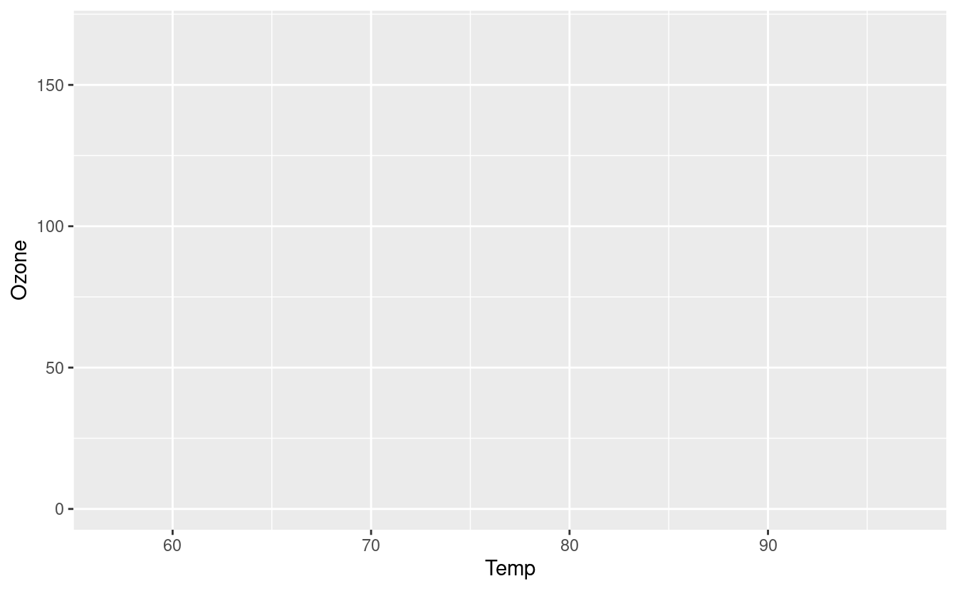
Notice that this base plot doesn’t actually plot anything other than the axes, axes labels, and background! If we want to plot scatter points or lines, we can do that by adding them as additional layers.
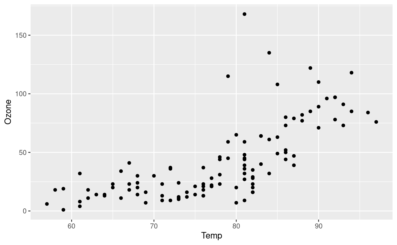
To make a scatter plot of Temp vs. Ozone, we’ll add a geom_point() layer to our base plot with the + symbol.
ggplot(data = airquality.complete, aes(x=Temp, y=Ozone)) +
  geom_point()
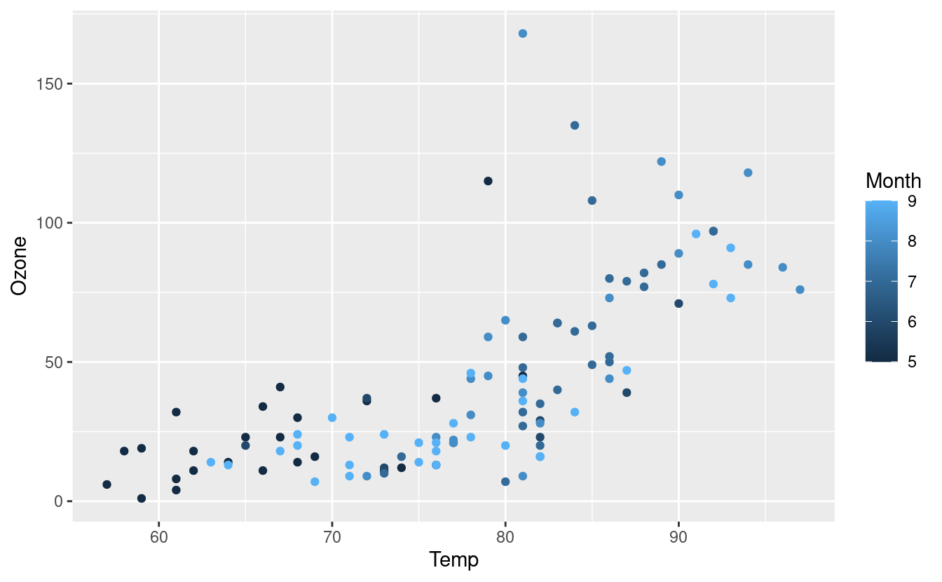
We can change the color of the points by using an aesthetic mapping via an aes() input inside the geom_point() layer. There are five months in our dataset (May through September) and they are represented by the numbers 5 through 9.
By default, R treats variables containing numbers as continuous, which means that R assumes that the Month variable could contain any numeric value, including 5.6 or 7.28. So when we specify that the points should be colored according to the value in the Month variable, we get a gradient coloring.
ggplot(data = airquality.complete, aes(x=Temp, y=Ozone)) +
  geom_point(aes(color=Month))
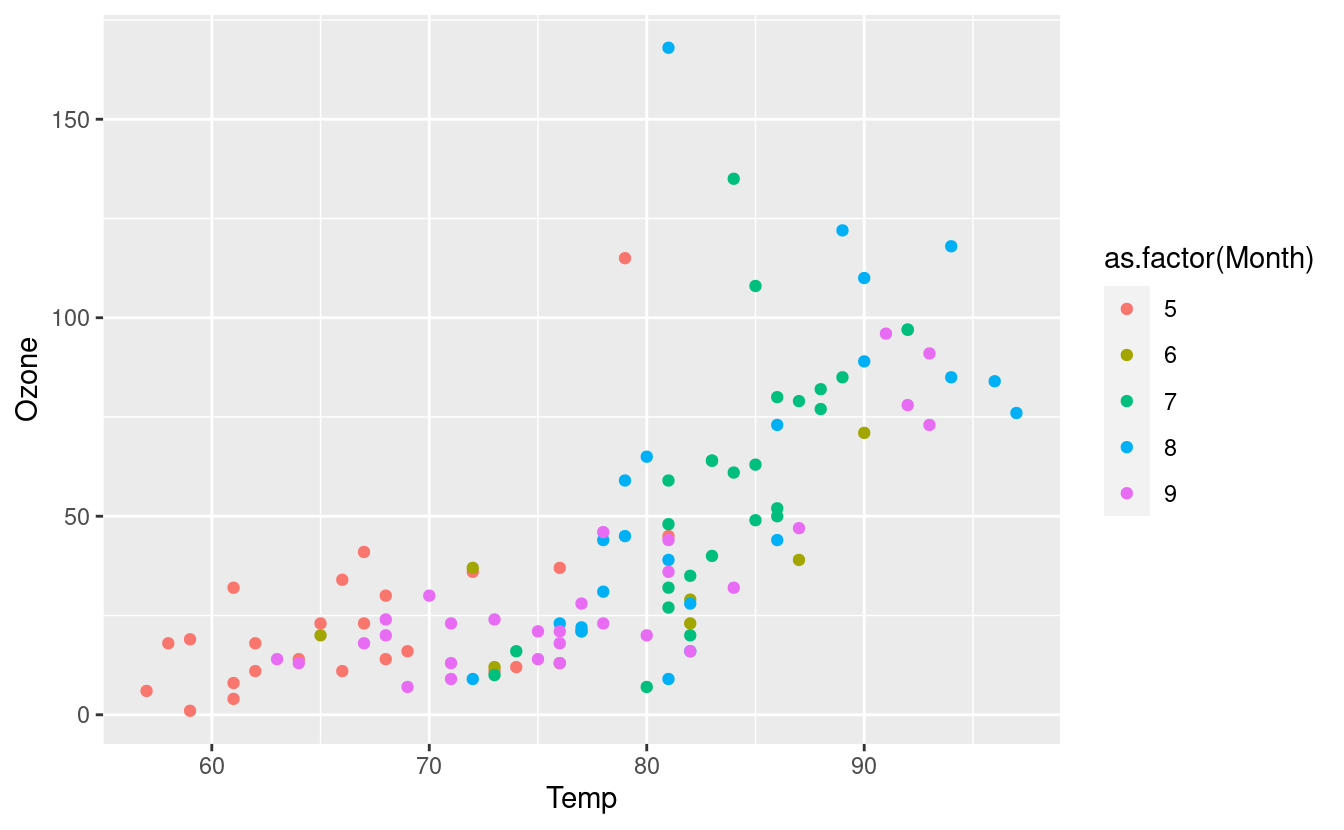
If we want to make it clear that the months can only take on discrete values so that only the numbers 5, 6, 7, 8, 9 are possible, we can include as.factor() around the Month variable. This tells R that we will treat the Month variable as a factor, or categorical variable. Now the coloring follows a discrete color palette.
ggplot(data = airquality.complete, aes(x=Temp, y=Ozone)) +
  geom_point(aes(color=as.factor(Month)))
We can also update our airquality.complete dataset so that R knows to treat our Month variable as a factor, or categorical variable. This relieves us from having to use the as.factor() around Month in the future.
airquality.complete$Month <- as.factor(airquality.complete$Month)Let’s test out our new assignment by having ggplot2 change the color and shape of the points based on their values in the Month variable. We can do that with the following.
ggplot(data = airquality.complete, aes(x=Temp, y=Ozone)) +
  geom_point(aes(color=Month, shape=Month))
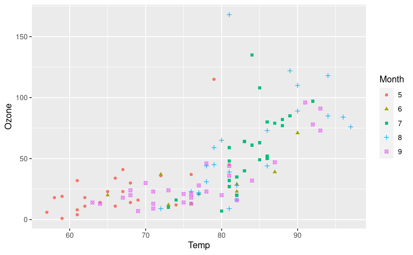
There’s a lot going on in this plot now so maybe you wouldn’t want to change both the color and shape based on a single variable! Nonetheless, we see that R now knows that Month is a categorical variable.
Changing colors with color brewer palettes
Let’s say we want to change the colors of these points. There are several ways we can do this. One way to do this is to use the default color brewer palettes available in ggplot2.
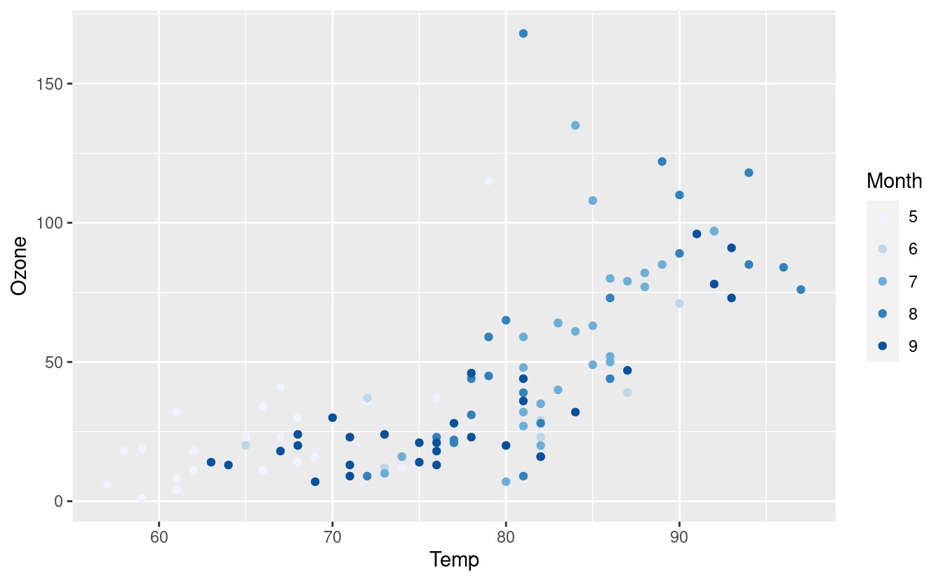
To do that, we can add the scale_colour_brewer() layer to specify a particular color palette. Below, we’re using the default color palette because we haven’t specified anything within the scale_colour_brewer() layer.
ggplot(airquality.complete, aes(x=Temp, y=Ozone)) +
  geom_point(aes(color=Month)) +
  scale_colour_brewer()
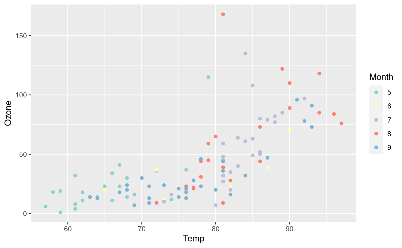
If we want to specify a different color palette, we can do that by choosing one from the options in this gallery. Below, we’re using the Set3 palette.
ggplot(airquality.complete, aes(x=Temp, y=Ozone)) +
  geom_point(aes(color=Month)) +
  scale_colour_brewer(palette = "Set3")
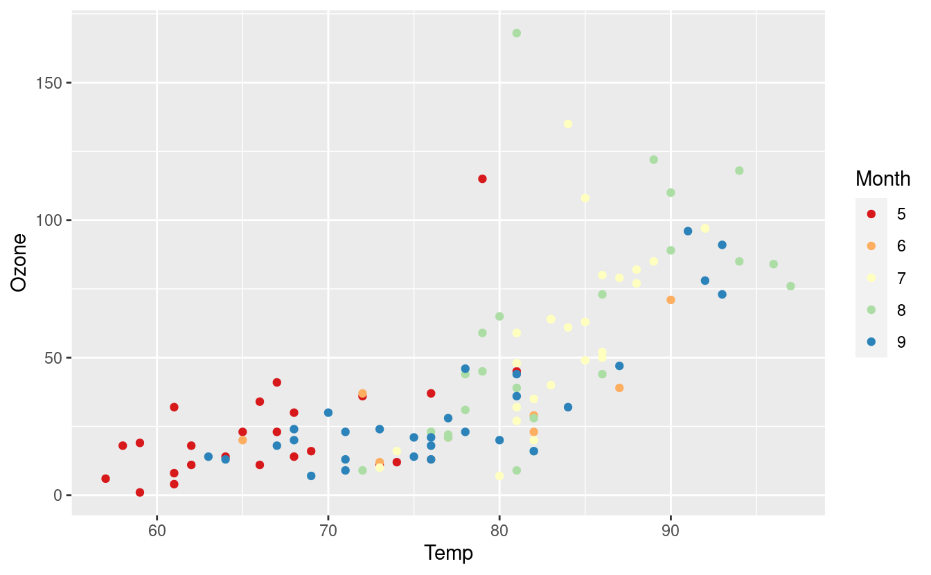
Here’s the same plot with the Spectral palette.
ggplot(airquality.complete, aes(x=Temp, y=Ozone)) +
  geom_point(aes(color=Month)) +
  scale_colour_brewer(palette = "Spectral")
Manually choosing colors
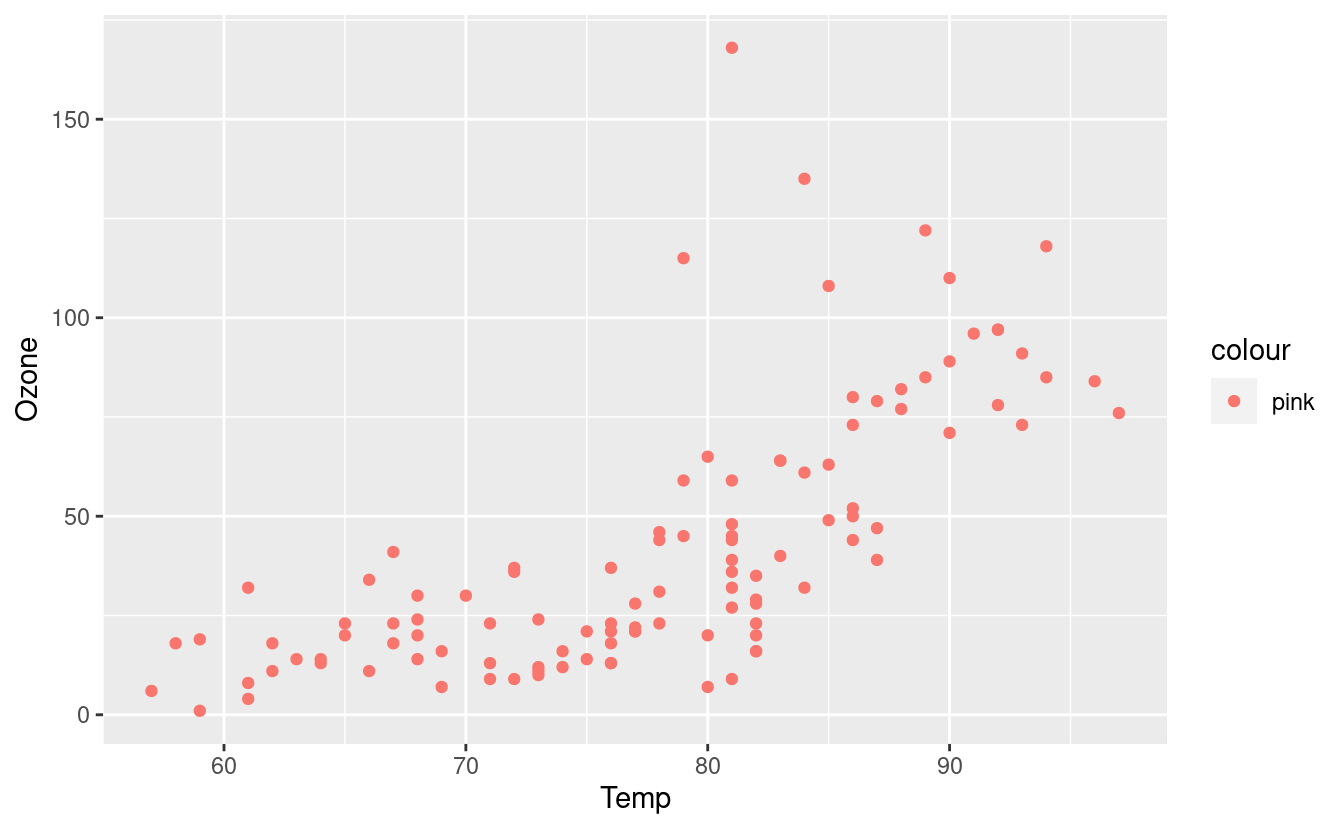
If we want to manually pick a color, we can do that by specifying the color in the aes() input inside the geom_point() layer. This will tell ggplot2 that we want to color all the points this color rather than varying the colors based on their value in the Month variable.
ggplot(airquality.complete, aes(x=Temp, y=Ozone)) +
  geom_point(aes(color="pink"))
We can also color based on the Month variable but manually select our own colors. Since there are five unique months in the Month variable, we’d need to input at least as five colors.
ggplot(airquality.complete, aes(x=Temp, y=Ozone)) +
  geom_point(aes(color=Month)) +
  scale_colour_manual(values = c("blue", "pink", "green", "yellow", "orange"))
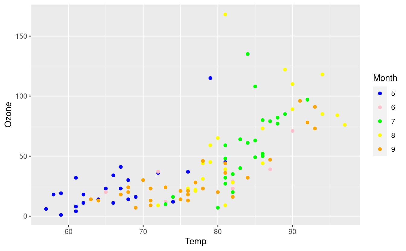
Notice that this pink is not the same color as the pink we got when using the aes() input in the geom_point() layer. This is because ggplot2 mapped our color="pink" in the aes() input to its own pre-selected color choice for pink but did not do this when we manually selected our own colors.
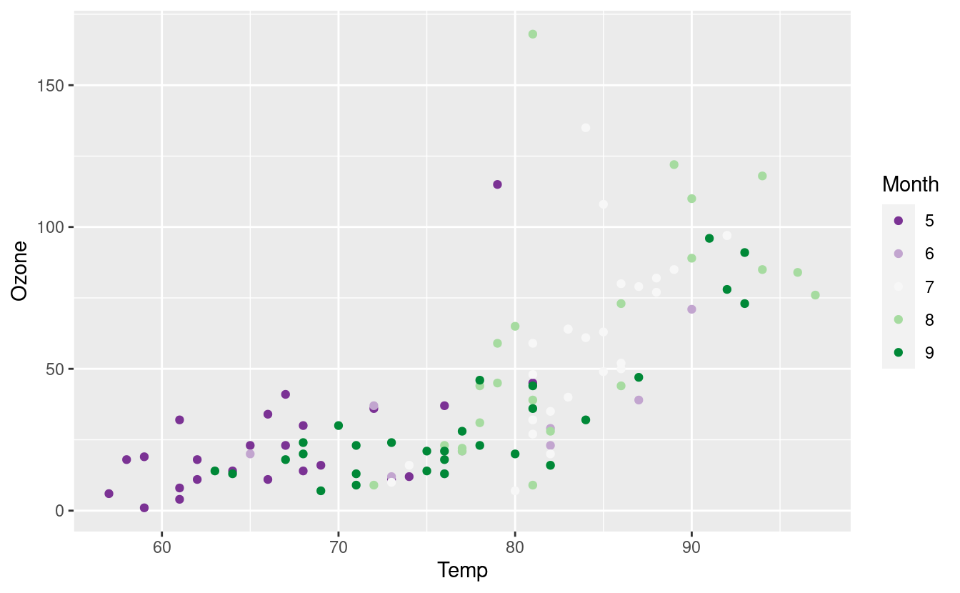
What if we have a particular blue or orange in mind? We can specify those colors with HEX values! A very handy tool for identifying HEX values is this site for mapping colors to their HEX values. Below, we’re using this mapping to get HEX values for five classes with diverging colors.
We’ve also saved the base plot and its geom_point() layer as an object named p so we don’t have to retype the code for this base plot every time we want to call it.
p <- ggplot(airquality.complete, aes(x=Temp, y=Ozone)) +
  geom_point(aes(color=Month))
month_colors <- c("5" = "#7b3294", "6" = "#c2a5cf", "7" = "#f7f7f7", "8" = "#a6dba0", "9" = "#008837")
p + scale_colour_manual(values = month_colors)
The scale_color_manual() layer allows us to use other contributed color palettes, such as the ones from the MetBrewer package for R! We can use this package to access colors inspired by the Metropolitan Museum of Art in New York City!
To use the MetBrewer package, we first install it as follows.
install.packages("MetBrewer")Then we can load it and use it in our plots just as we would other manually selected colors. Below, we’re using the Renoir palette from MetBrewer!
library(MetBrewer)
p + scale_colour_manual(values = met.brewer("Renoir", 5))
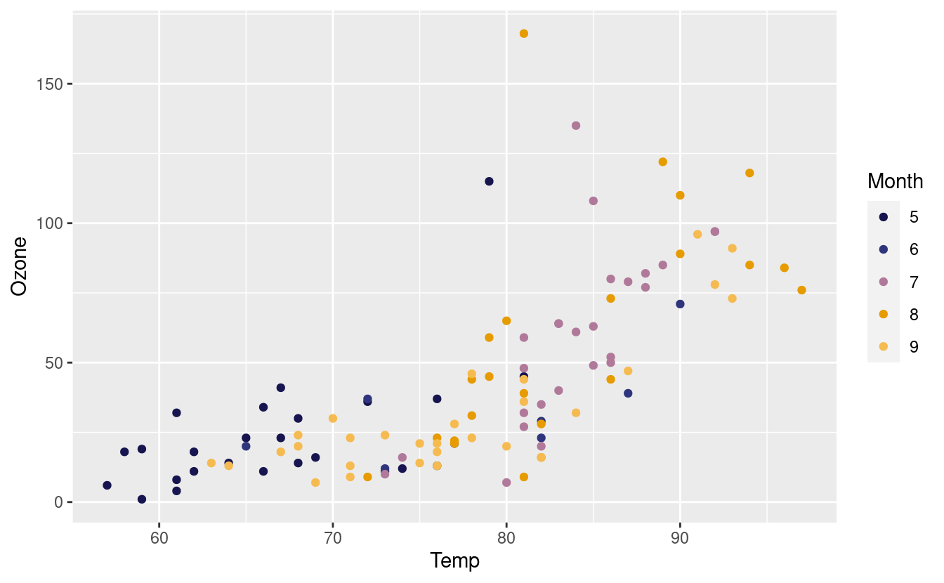
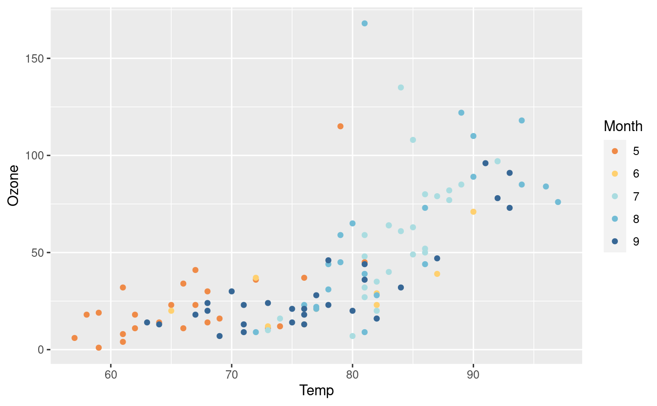
Here’s another one from the Hiroshige palette from MetBrewer! We also saved the original plot p with this new layer and saved it as p2 so we can call it later.
p2 <- p + scale_colour_manual(values = met.brewer("Hiroshige", 5))
p2
Labels and legends
Now that we’re very comfortable with changing the colors in our plots, let’s talk about labels and legends! For example, before we changed the Month variable to a factor, the legend title was as.factor(Month). That’s something we’d definitely want to fix!
There are many ways to alter the text and labels in ggplot2. Here, we’ll just look at some common approaches. First, we can add titles and change the axes labels via the labs() layer. We can also change the size and color of the text in each of those labels via the theme() layer.
p2 + labs(title = "Air Quality in NYC",
          x = "Temperature (degrees F)",
          y = "Mean ozone (parts per billion)",
          color = "Months") +
  theme(axis.text.x = element_text(size = 12),
        axis.title.x = element_text(size = 14, color="darkblue"),
        axis.text.y = element_text(size = 12),
        axis.title.y = element_text(size = 14, color="darkblue"),
        plot.title = element_text(size = 16, face = "bold", color = "orange"))
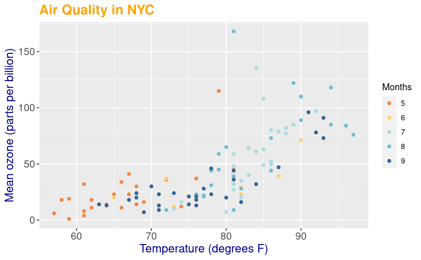
In the figure above, our legend explains our coloring choices so we indicated its label by specifying color in the labs() layer.
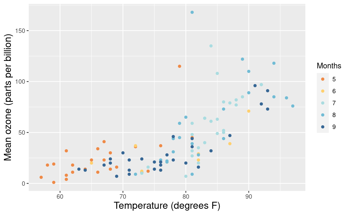
When embedding a figure inside a document, such as a report or article, we probably don’t want to specify an overall title. In that case, we can just omit the title input in the labs() layer. Alternatively, we can also specify just the x and y-axis labels via the xlabs() and ylabs() layers.
p2 + xlab("Temperature (degrees F)") +
  ylab("Mean ozone (parts per billion)") +
  theme(axis.title.x = element_text(size = 14),
        axis.title.y = element_text(size = 14)) +
  labs(color = "Months")
As an alternative to the labs() layer, we can also change the legend label with the guides() layer.
p2 + guides(color=guide_legend(title="Months"))
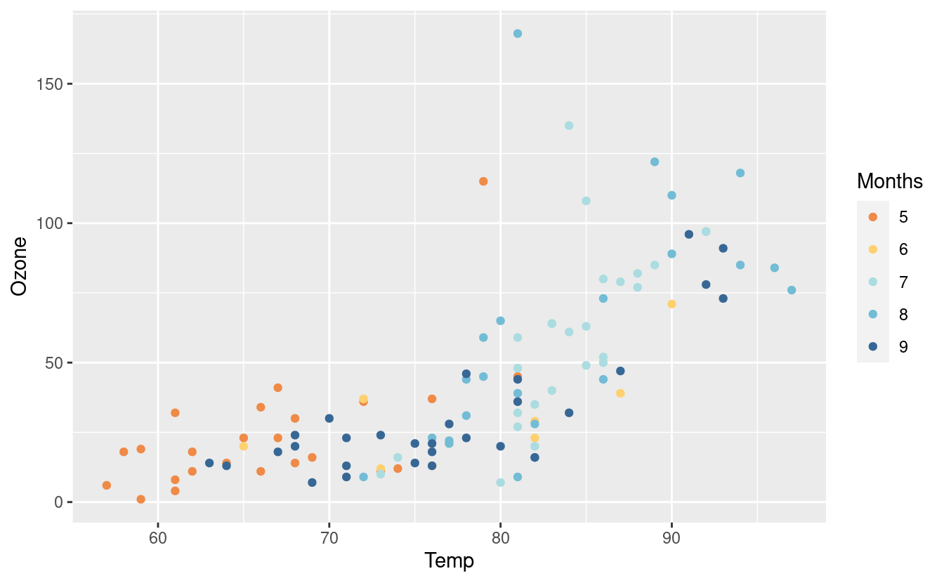
Yet another way to change the legend label is from within the scale_colour_manual(). As you can see, there are many different ways to do some things in ggplot2.
p + scale_colour_manual(values = met.brewer("Renoir", 5),
                        name = "Months")
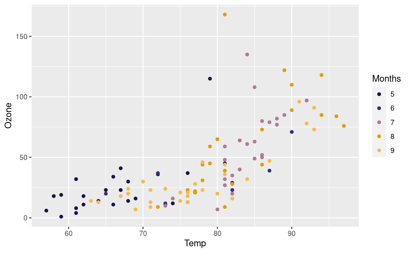
Since we altered the color of the points in the geom_point() layer, the legend explains that coloring choice. Consequently, the legend titles have to do with the color option. Alternatively, if we had altered the fill (as we will later in Part 2 of this tutorial), the legend titles would be related to the fill option instead.
Finally, if we want to remove the legend altogether, one way to do that is via the theme() layer.
p2 + theme(legend.position = "none") +
  xlab("Temperature (degrees F)") +
  ylab("Mean ozone (parts per billion)") +
  theme(axis.title.x = element_text(size = 14),
        axis.title.y = element_text(size = 14))
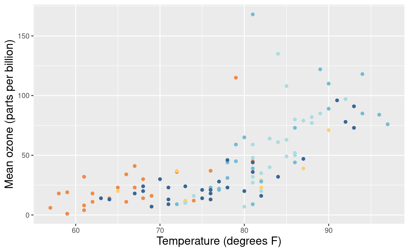
Okay, let’s put the legend back but this time, we want to change the labels of the months within the legend. We can do that by specifying labels within the scale_color_manual() layer.
p3 <- p + scale_colour_manual(values = met.brewer("Hiroshige", 5),
                        labels = c("May", "Jun", "Jul", "Aug", "Sep")) +
  xlab("Temperature (degrees F)") +
  ylab("Mean ozone (parts per billion)")
p3
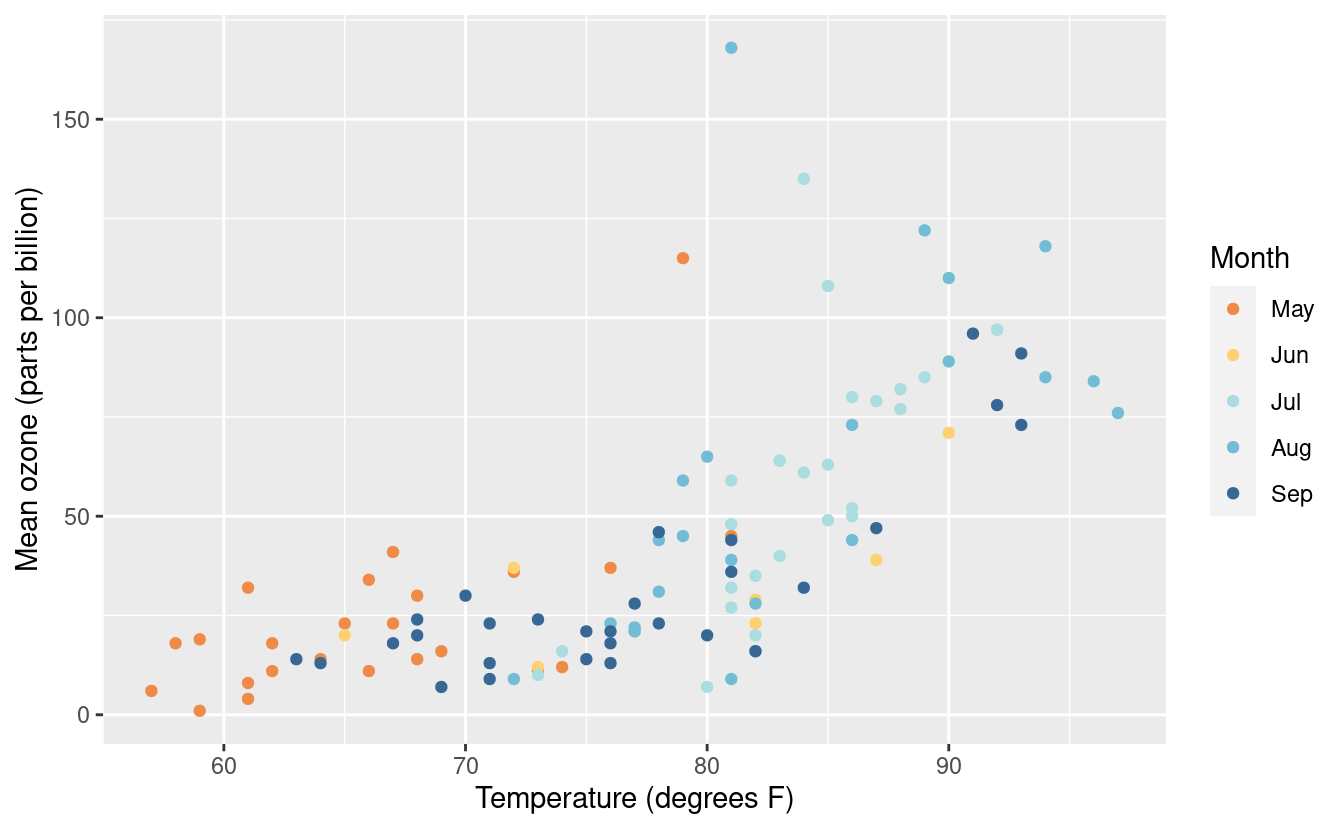
There are numerous other variations on changes within the legend. For more on changing the labels and legends, please see references here and here.
Changing the background and plot style
We’ve discussed changing colors, titles, axes labels, legend titles, legend labels, and fonts. There’s one more major formatting issue we can change! We can also change the background and overall plot style!
To do this, we can add a specific theme layer. We already saw that we can edit elements within the current theme with the theme() layer. If we want to change the theme, we can do that by specifying it from the options listed here. Below, we’re using the theme_light() option.
p3 + theme_light()
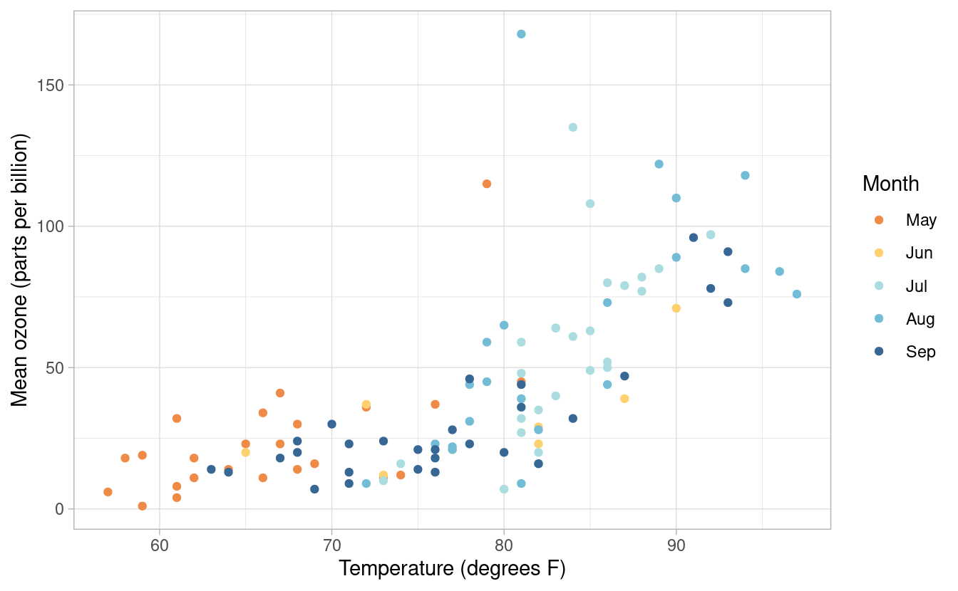
Here’s another example with the theme_classic() option.
p3 + theme_classic()
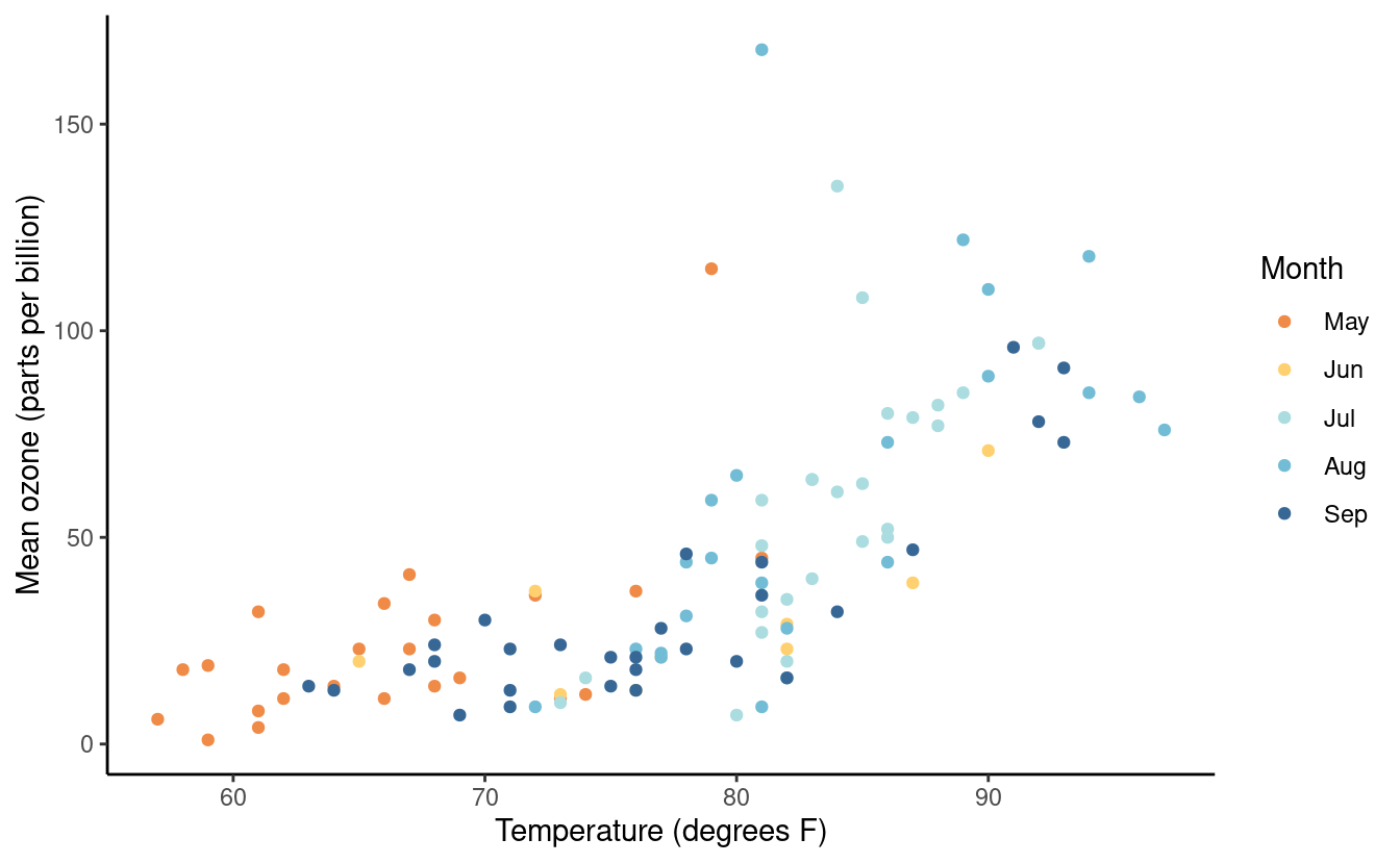
You can access even more themes by installing the ggthemes package for R! As usual, we can install it from CRAN with the following.
install.packages("ggthemes")After loading the package, we can use it as we would any other theme in ggplot2. Below is an example with theme_tufte().
library(ggthemes)
p3 + theme_tufte() +
  theme(axis.title.x = element_text(size = 14),
        axis.title.y = element_text(size = 14))
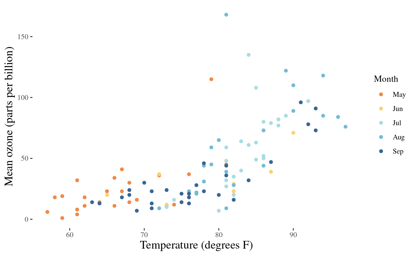
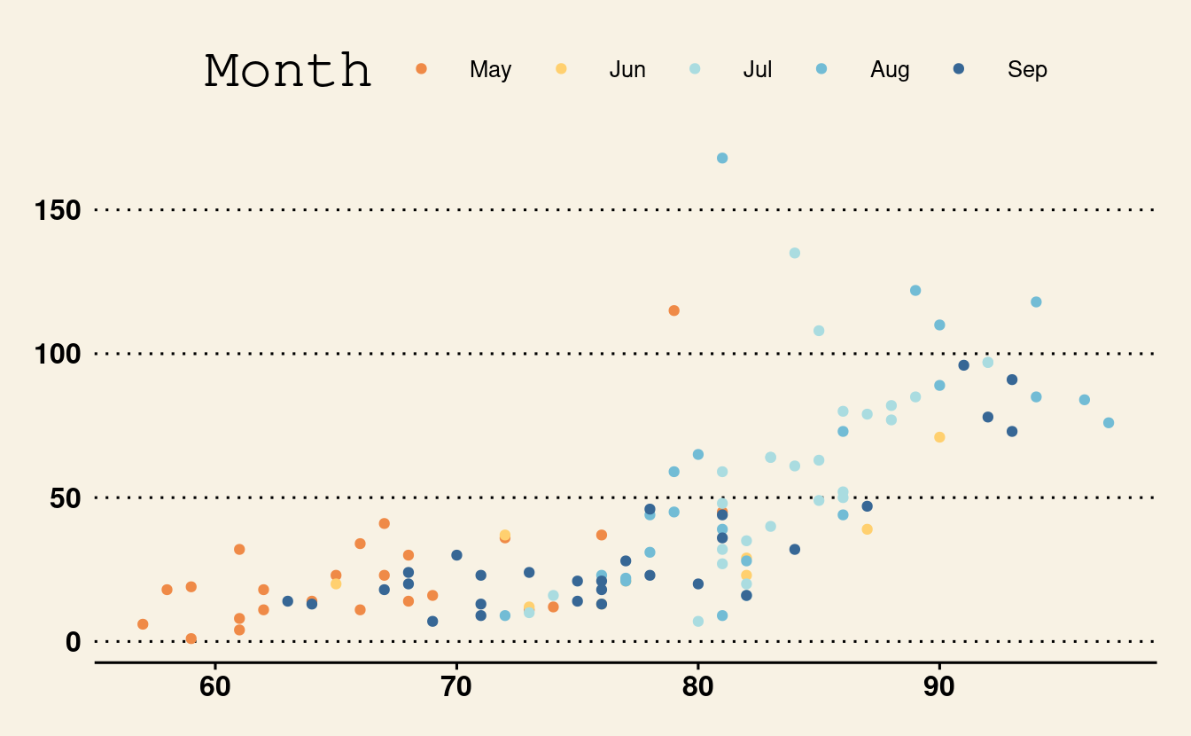
Below is another example using theme_wsj().
p3 + theme_wsj()
Great job!

That was a lot of material we just covered! We covered the basics of plotting in ggplot2 with a basic scatterplot. We also experimented with many options for changing the colors of the points, updating variables within a dataset, modifying axes and legend labels, and changing the background and overall plot style. In Part 2 of this tutorial, we’ll go over other common types of plots. We’ll also learn how to plot multiple plots in one plot based on differing values in one or two variables via facets!

