Getting Started with Data Visualizations in R (Part 2)
In our last post on Getting Started with Data Visualizations in R, we went over how to start using ggplot2 in R. We learned how to set up a basic scatterplot and how to change the colors of the points via a variety of methods. We also learned how to update our plot for categorical variables, and how to add labels, change fonts, and alter the legend.
Today, we're continuing with Part 2 of this tutorial! In this post, we'll look at some other common plots and their variations. We'll also learn how to plot multiple plots in one plot. Finally, we'll go over how to save our plots.
If you're new to R, I have a tutorial on getting started with coding in R in a two-part series (Part 1 and Part 2). This series will get you up to speed on installing and using R and RStudio so you can follow along with this post!
Load data and the ggplot2 package
Let's get started by loading the ggplot2 library and the airquality dataset again! Since methods for handling missing data are beyond the scope of this tutorial, we'll omit the observations with NA values again for now.
library(ggplot2)
data("airquality")
airquality.complete <- na.omit(airquality)
Before we move away from the scatterplot, there's a variation that we might occasionally find very useful. One way to highlight a trend in the data is by adding a line through the points on the scatterplot.
How to overlay a line on a scatterplot
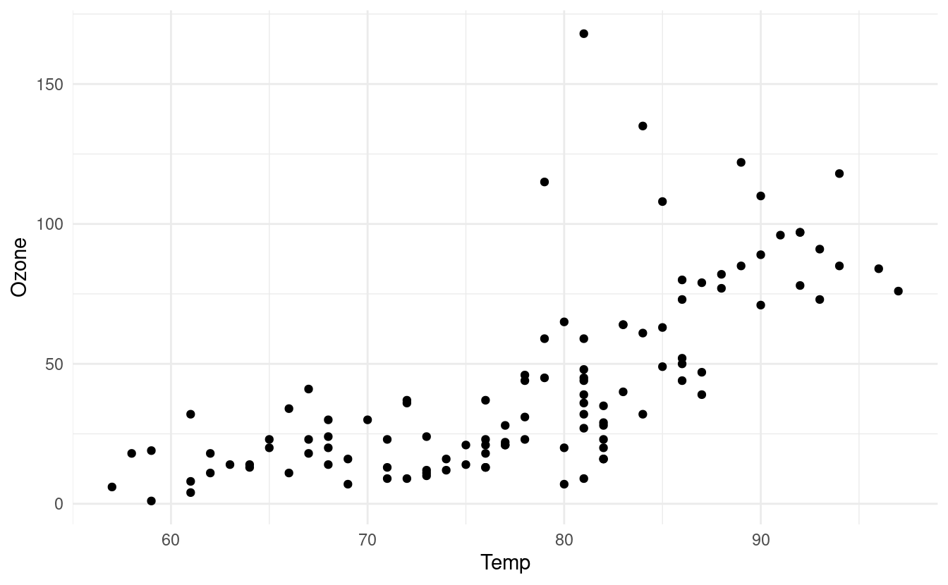
Let's see how to do this! First, we'll initialize a basic plot and add some points to it by adding a geom_point() layer again. We'll also use the theme_minimal() layer again to adjust the overall style of our plot.
p <- ggplot(data=airquality.complete, aes(Temp, Ozone)) +
  geom_point() +
  theme_minimal()
p
We can add a smooth line that runs through the points in our scatterplot by adding a geom_smooth() layer. There are a number of ways to find a smooth line that runs through the points. For more details on the different methods available in the geom_smooth() layer, we can refer to the documentation for geom_smooth().
How to fit a LOESS line through the points
In our case, we have fewer than 1,000 observations so if we don't specify which method we want to use, geom_smooth() will default to fitting a locally estimated scatterplot smoothing (LOESS) line.
p + geom_smooth()
#> `geom_smooth()` using method = 'loess' and formula 'y ~ x'
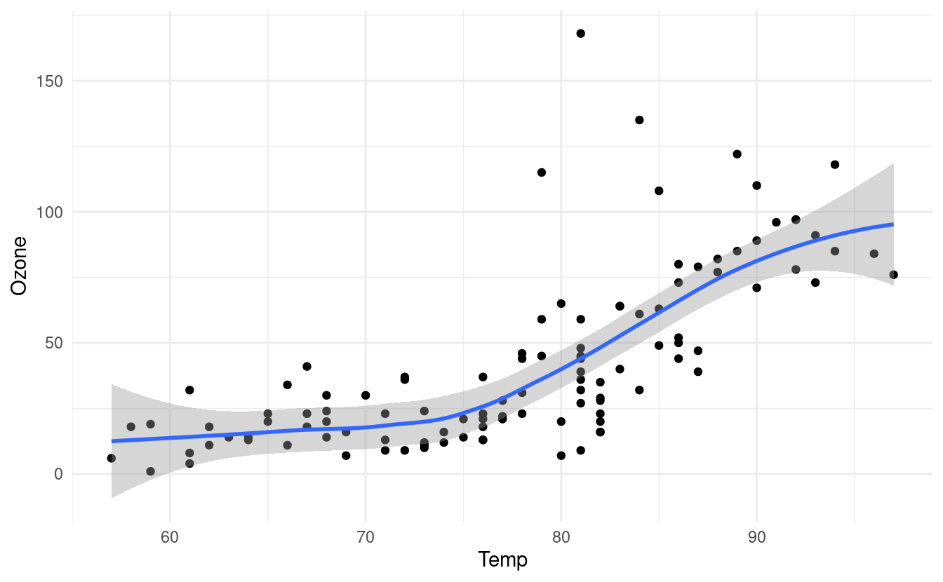
The gray band around the line here shows a confidence interval around the smoothed line. We worked a bit with confidence intervals in our post on uncertainty quantification with the Central Limit Thereom. If you want to read a little more about confidence intervals, please refer to the explanation and corresponding R code at the bottom of that post.
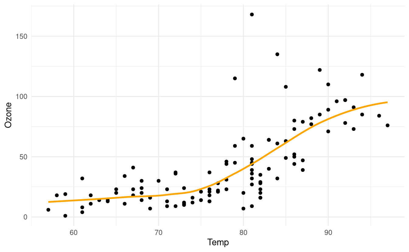
If we don't want to plot the confidence interval, we can specify se=FALSE inside the geom_smooth() layer. We can also specify the color of the line by specifying a value for colour inside the geom_smooth() layer.
p + geom_smooth(se=FALSE, colour="orange")
#> `geom_smooth()` using method = 'loess' and formula 'y ~ x'
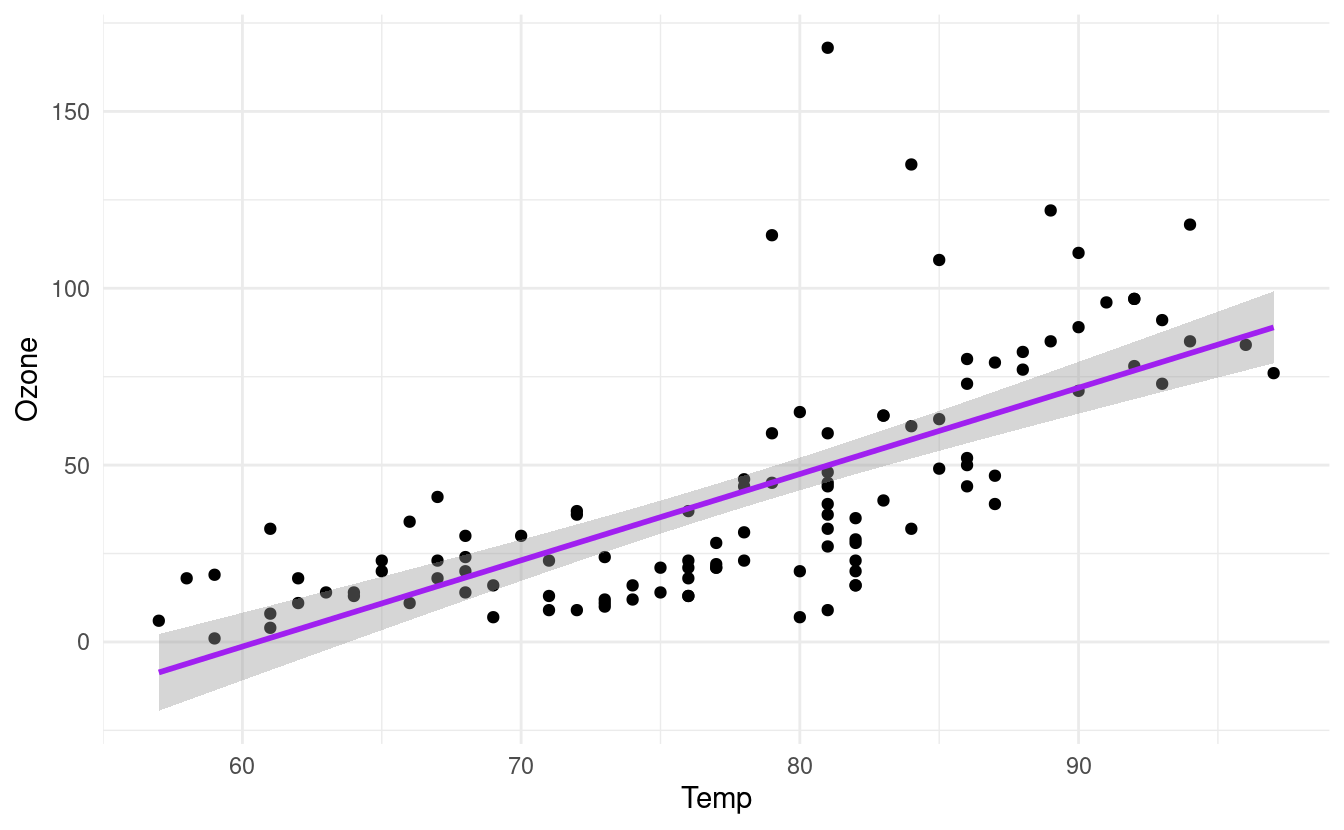
How to fit a least squares line through the points
If we want to change the method of the line, we can do that by specifying method inside the geom_smooth() layer. The geom_smooth() documentation in ggplot2 shows the different choices for these methods.
For example, let's say we want to fit a straight line through the data. This is often referred to as a least squares fit line. We can do that by specifying method=lm inside the geom_smooth() layer. Here, lm stands for linear model and is also the name of the function, lm(), that fits a straight line through the data.
p + geom_smooth(method="lm", colour="purple")
#> `geom_smooth()` using formula 'y ~ x'
How to plot histograms
Another common plot type is the histogram. We can plot histograms by adding a geom_histogram() layer. This is great when we want to depict count data, such as how many times a particular event occurs.
For example, we can use a histogram to see how many days exhibit varying ozone levels (in parts per billion, or ppb). Below, we see that there were very few days for which the ozone level exceeded 100 ppb. In fact, the majority of the days had ozone levels less than 75 ppb.
ggplot(airquality.complete, aes(x=Ozone)) +
  geom_histogram() +
  theme_minimal()
#> `stat_bin()` using `bins = 30`. Pick better value with `binwidth`.
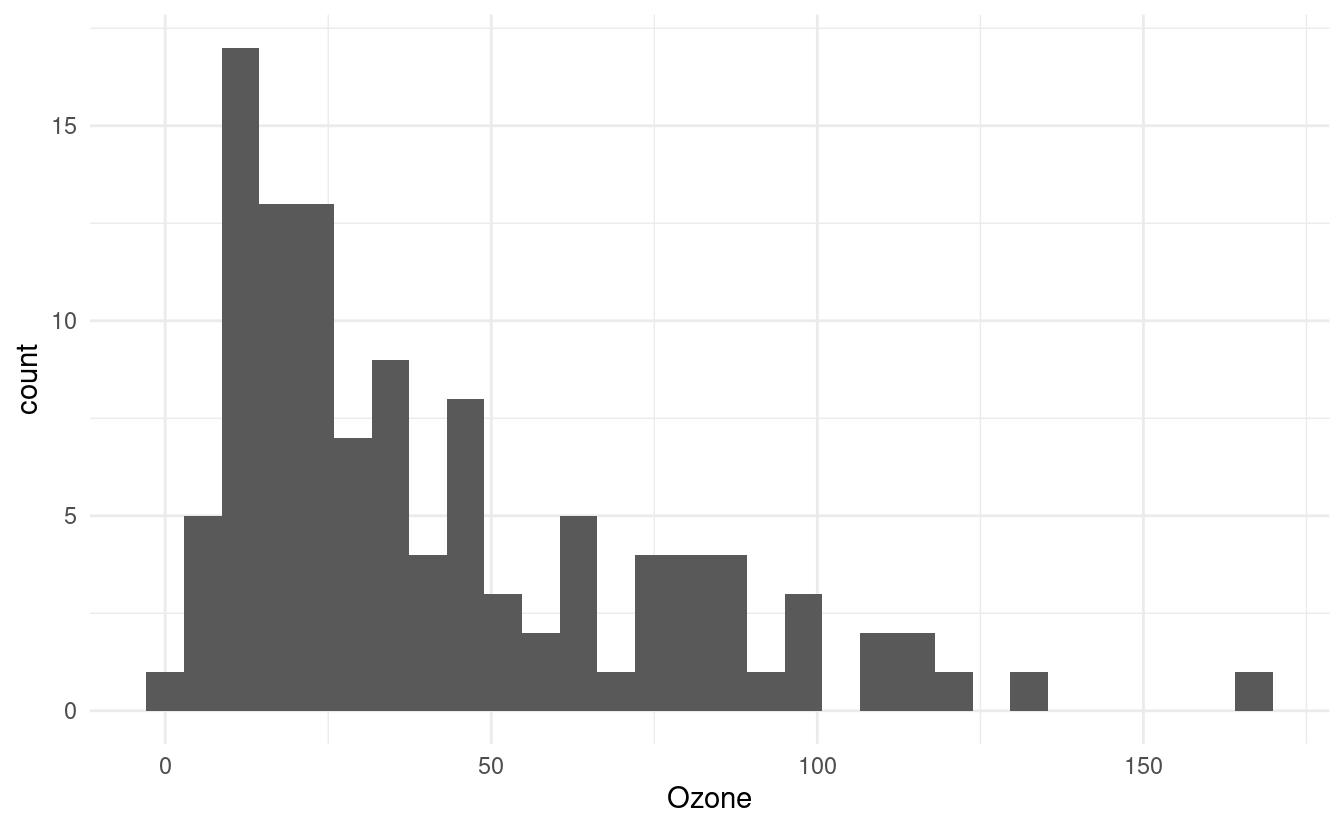
Notice that when we initiated this plot, we only specified x=Ozone in the aes() mapping. This is because histograms depict counts, or frequencies, on the secondary axis. If we had specified y=Ozone instead, our histogram orientation would be flipped so that the counts are depicted along the x-axis.
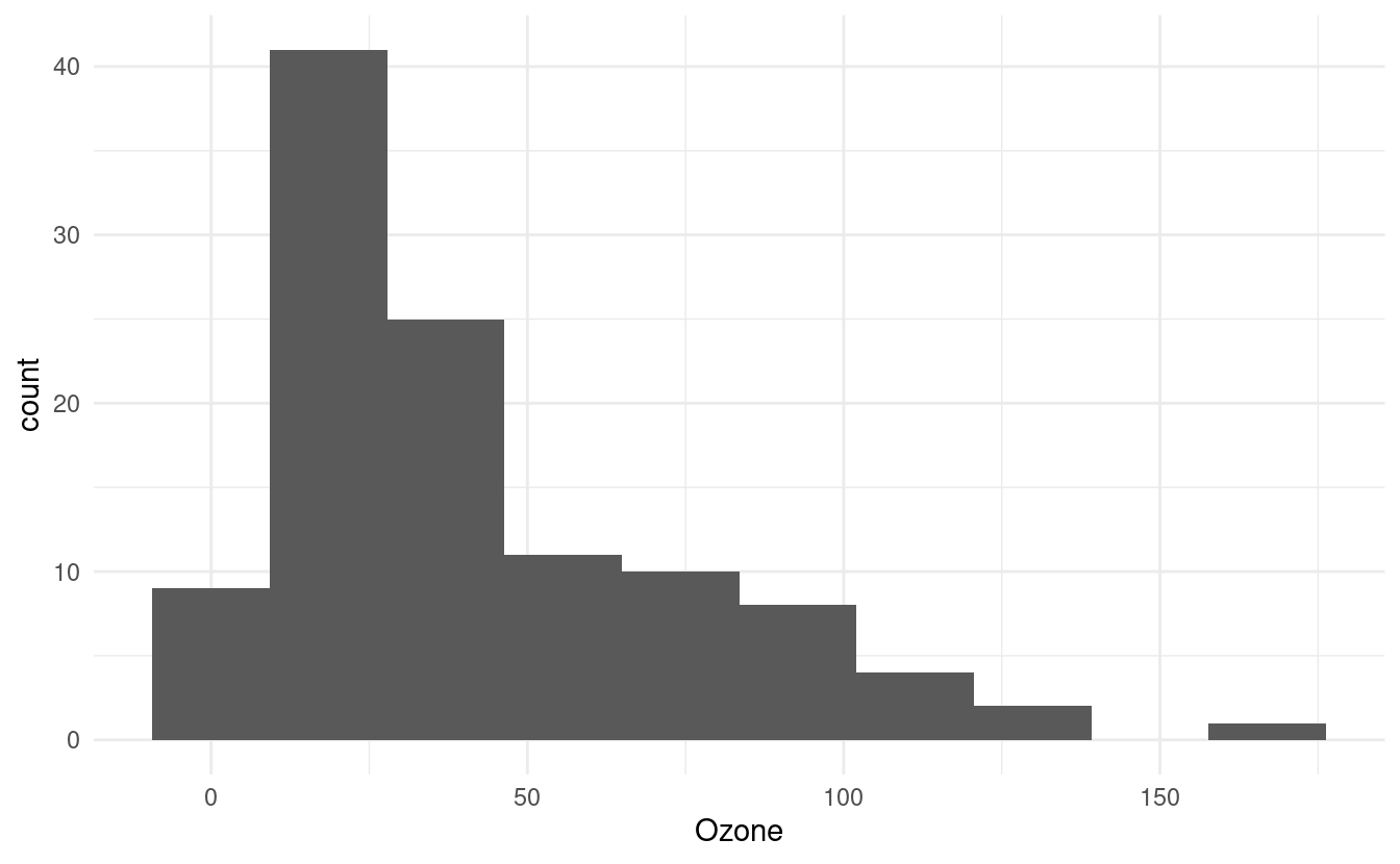
How to change the number of bins in the histogram
The default number of bins in geom_histogram() is 30. We can change that by specifying a different number of bins via bins inside the geom_histogram() layer.
ggplot(airquality.complete, aes(x=Ozone)) +
  geom_histogram(bins=10) +
  theme_minimal()
How to change the colors of the histogram
We can change the colors of the bins and their outlines by specifying fill and colour inside the geom_histogram() layer. The fill input dictates the color of the bin itself while the colour input dictates the color of the bin borders.
ggplot(airquality.complete, aes(x=Ozone)) +
  geom_histogram(bins=10, colour="#c0cc00", fill="#f50a60") +
  theme_minimal()
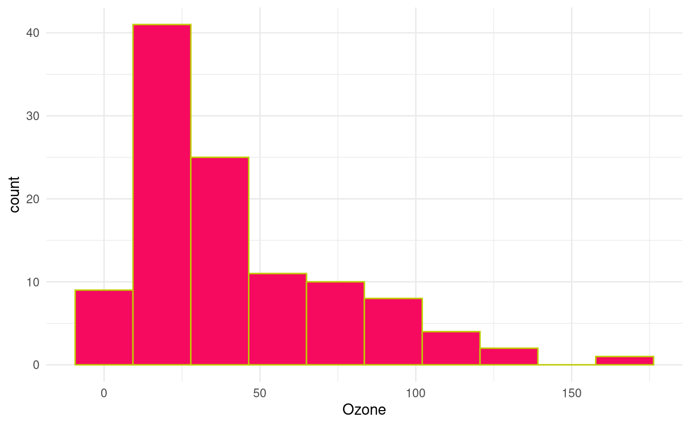
In the figure above, we've specified HEX values for the colors from this webpage showing HEX values for popular web colors. Previously, we went over many options and resources for changing colors in Part 1 of this tutorial. Those methods are generally applicable to visualizations made with ggplot2 so we can apply those methods (as appropriate for a particular variable type) to these plots as well.
If we want to see other elements we can alter when plotting histograms, we can find those in the documentation for geom_histogram() in ggplot2.
How to plot boxplots
Next, let's see how to make boxplots! You might have also heard these referred to as box-and-whisker plots.
Boxplots are great when we want to see the distribution of values in a continuous variable. We briefly talked about continuous and categorical variables in Part 1 of this tutorial when we talked about coloring based on values in the Month variable.
If we look at our data with the head() function, we see that Ozone, Solar.R, Wind, and Temp should be continuous while Month should be a factor. This is because the numbers in Month are placeholders for the months May through September. Meanwhile, the Day variable takes on discrete values since it can only take on integer values from 1 through 31.
head(airquality.complete)
#>   Ozone Solar.R Wind Temp Month Day
#> 1    41     190  7.4   67     5   1
#> 2    36     118  8.0   72     5   2
#> 3    12     149 12.6   74     5   3
#> 4    18     313 11.5   62     5   4
#> 7    23     299  8.6   65     5   7
#> 8    19      99 13.8   59     5   8
Let's say we want to see the distribution of values in the Ozone variable. We can plot a boxplot in ggplot2 by adding a geom_boxplot() layer. Below, we've specified y=Ozone because we wanted to plot a vertical boxplot. If we want to plot a horizontal boxplot, we could specify x=Ozone instead.
ggplot(airquality.complete, aes(y=Ozone)) +
  geom_boxplot() +
  theme_minimal()
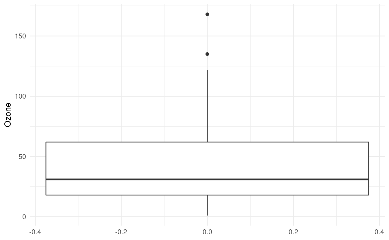
How to interpret a boxplot
The default value for the middle line in the box is the median, or the 50th percentile, of the Ozone variable. The bottom of the box shows the first quartile, or the 25th percentile, of the Ozone variable. This is also referred to as the lower hinge. The top of the box shows the third quartile, or the 75th percentile. This is also referred to as the upper hinge.
The lines extending from the box are sometimes referred to as whiskers. The positions of the whiskers depend on the interquartile range (IQR). This is the difference between the third and first quartiles. The top (or upper) whisker extends until the largest value in Ozone that is within 1.5 \(\times\) IQR above the upper hinge. The bottom (or lower) whisker extends until the smallest value in Ozone that is within 1.5 \(\times\) IQR below the lower hinge.
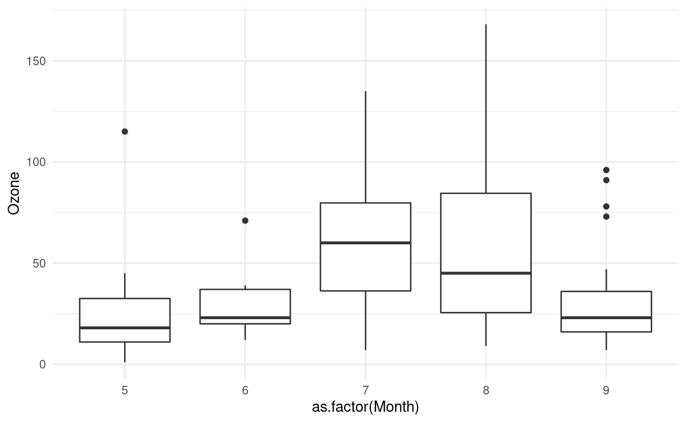
How to plot a boxplot for each level in a factor variable
If we want to plot a boxplot of the Ozone data for each month in airquality.complete, we can do that by specifying x=as.factor(Month). Just as in Part 1 of this tutorial, we have to tell R that the Month variable is a factor otherwise it will treat it as a continuous variable.
ggplot(airquality.complete, aes(x=as.factor(Month), y=Ozone)) +
  geom_boxplot() +
  theme_minimal()
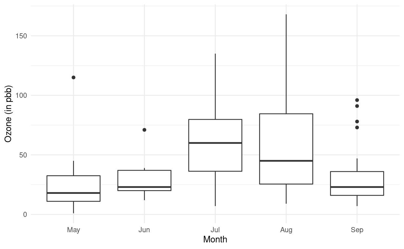
How to update level names in a factor variable
Let's update our Month variable so that it is a factor and let's also recode the values in Month so that they show the actual month names. We can do both of those things simultaneously with the factor() function in R.
airquality.complete$Month <- factor(airquality.complete$Month,
                                    labels=c("May", "Jun", "Jul", "Aug", "Sep"))
Now if we look at our data again using the head() function, we'll see that the entries for Month have been updated to the month names!
head(airquality.complete)
#>   Ozone Solar.R Wind Temp Month Day
#> 1    41     190  7.4   67   May   1
#> 2    36     118  8.0   72   May   2
#> 3    12     149 12.6   74   May   3
#> 4    18     313 11.5   62   May   4
#> 7    23     299  8.6   65   May   7
#> 8    19      99 13.8   59   May   8
Now when we remake our plot, the month names will show up along the x-axis. Let's also use what we learned from the last post and rename the axes labels!
ggplot(airquality.complete, aes(x=Month, y=Ozone)) +
  geom_boxplot() +
  theme_minimal() +
  xlab("Month") +
  ylab("Ozone (in pbb)")
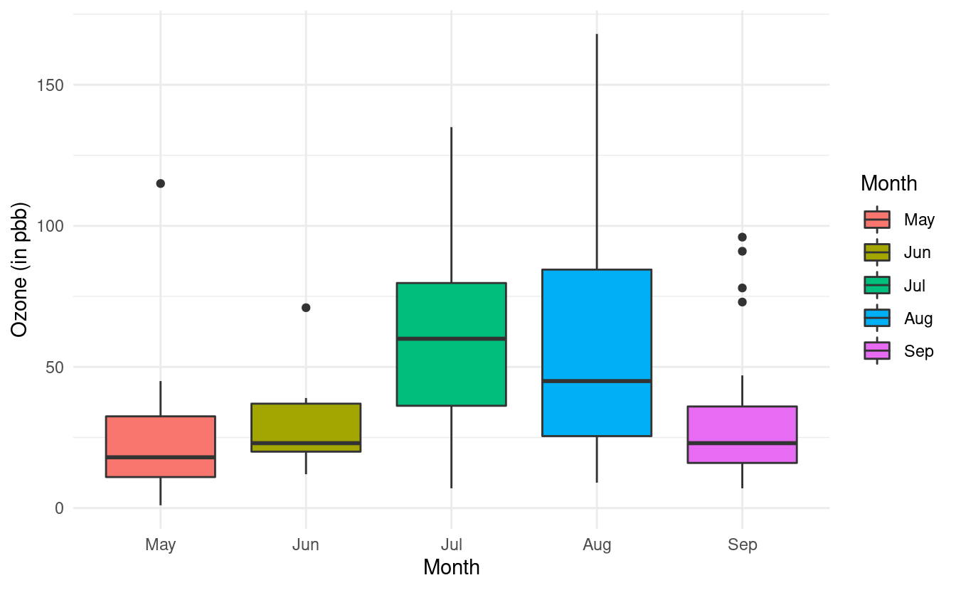
How to change the fill colors of the boxplots
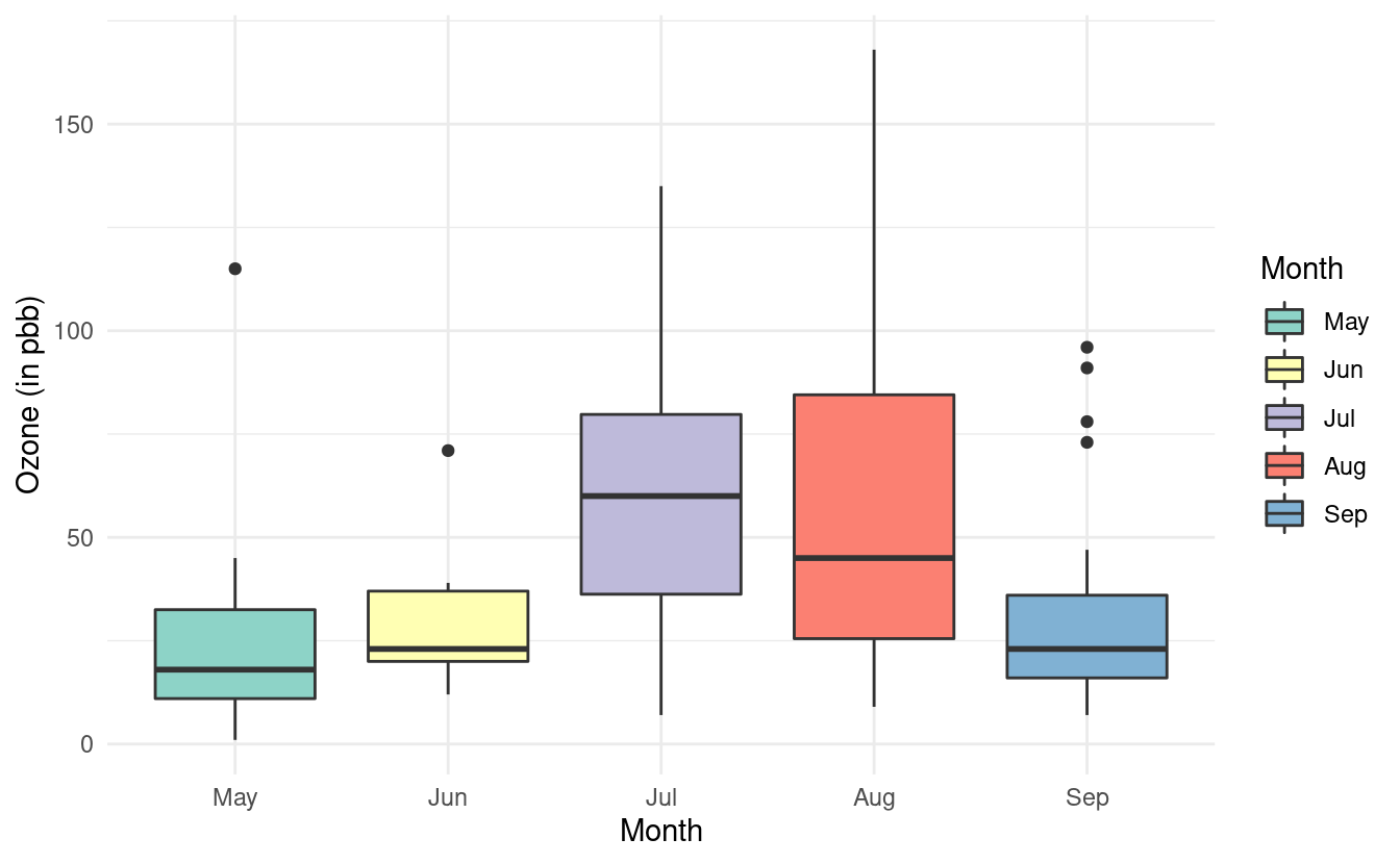
Finally, we can add some colors to these boxplots just as we did in Part 1 of this tutorial. To do this, we need to specify the variable we want to use to determine the fill of the boxplots. In this case, we want to fill in the color of the boxplots based on the Month variable so we will specify fill=Month.
ggplot(airquality.complete, aes(x=Month, y=Ozone, fill=Month)) +
  geom_boxplot() +
  theme_minimal() +
  xlab("Month") +
  ylab("Ozone (in pbb)")
If we want to specify a different color palette, we can do that by adding a scale_fill_brewer() layer and specifying the palette choice within that layer. Below, we are again using the Set3 color brewer palette.
ggplot(airquality.complete, aes(x=Month, y=Ozone, fill=Month)) +
  geom_boxplot() +
  theme_minimal() +
  xlab("Month") +
  ylab("Ozone (in pbb)") +
  scale_fill_brewer(palette="Set3")
Notice that we specified the fill rather than the colour here. By contrast, when we were changing the colors of the scatterplot points, we specified the colour. This is because ggplot2 uses colour to denote the color of lines and points, and uses fill to denote the color when we fill-in the color of something like a box.
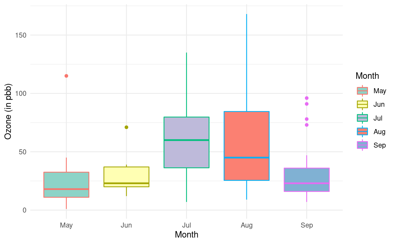
How to change the border colors of the boxplots
If we additionally specify colour, we can change the color of the lines on our boxplots. If we don't specify a color brewer palette for the colors via a scale_color_brewer() layer, the line colors will be the default colors for factors.
ggplot(airquality.complete, aes(x=Month, y=Ozone, fill=Month, color=Month)) +
  geom_boxplot() +
  theme_minimal() +
  xlab("Month") +
  ylab("Ozone (in pbb)") +
  scale_fill_brewer(palette="Set3")
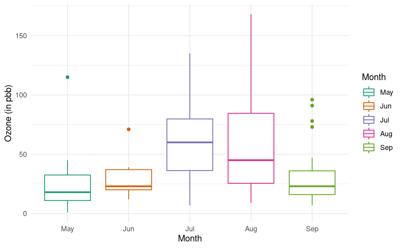
We can change these colors by adding a scale_color_brewer() layer. If we don't want to fill in the color of the boxplots, we can omit the fill=Month mapping from the base plot and the scale_fill_brewer() layer.
ggplot(airquality.complete, aes(x=Month, y=Ozone, color=Month)) +
  geom_boxplot() +
  theme_minimal() +
  xlab("Month") +
  ylab("Ozone (in pbb)") +
  scale_color_brewer(palette="Dark2")
For more variations on boxplots, we can refer to the documentation on geom_boxplots() in ggplot2.
How to plot bar plots
Another useful plot we want to make is the bar plot, also called a bar chart in ggplot2. To illustrate the usefulness of this plot, we'll use medal counts from the 2022 Winter Olympics! I saved the Wikipedia medal table for the 2022 Winter Olympics in a text file so that we can load the data into R.
How to load your own data into R
We'll use the read.csv() function in R to load this data into our workspace.
olympics <- read.csv("https://thebitwise.org/olympic_medals_2022/",
sep="\t", header=FALSE)
colnames(olympics) <- c("country", "gold", "silver", "bronze", "total")
head(olympics)
#> country gold silver bronze total
#> 1 Norway 16 8 13 37
#> 2 Germany 12 10 5 27
#> 3 China 9 4 2 15
#> 4 United States 8 10 7 25
#> 5 Sweden 8 5 5 18
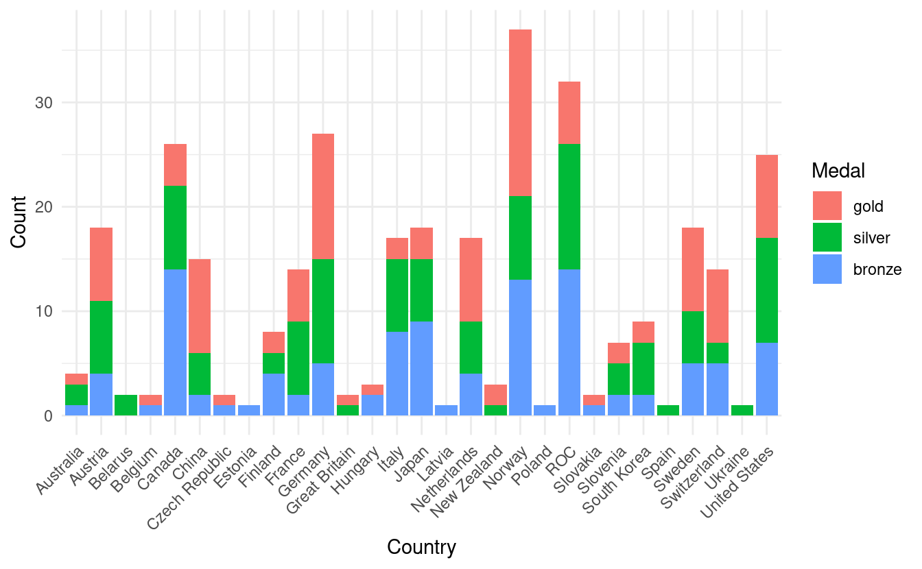
#> 6 Netherlands 8 5 4 17A quick look at our olympics data with the head() function shows us that the data contains the number of gold, silver, bronze, and total medal counts for each country. We can plot the total medal count by country by adding a geom_bar() layer to a base ggplot plot.
How to plot a basic bar plot and rotate axis tick labels
The default behavior in geom_bar() is similar to the histogram. To get a bar plot that uses the actual values in a variable, we insert stat="identity" inside the geom_bar() layer. Alternatively, we can also use the geom_col() instead.
In the bar plot below, we've rotated the country names by 45 degrees on the x-axis so that they don't overlap with each other.
ggplot(olympics, aes(x=country, y=total)) +
  geom_bar(stat="identity") +
  theme_minimal() +
  theme(axis.text.x = element_text(angle = 45, vjust=1, hjust=1))
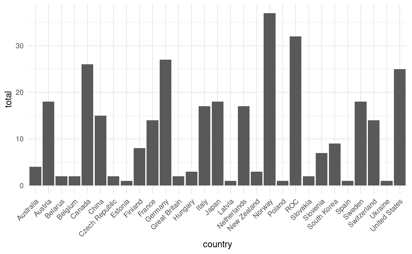
Notice that we used both the theme_minimal() layer to adjust the overall plot style and the theme() layer to rotate the x-axis tick labels. If we had applied the theme_minimal() layer after the theme() layer, the settings within theme_minimal() would have overwritten our text rotations. In this case, order makes a difference!
How to plot a stacked bar plot
This plot is interesting but maybe we want to depict more than just the total medal count. If we want to show the breakdown of the medal counts by their colors, we need to first reshape our medal color variables into a single variable to input into the ggplot() function.
We can do this via the melt() function in the reshape2 package. To use this function, we first install the reshape2 package with the following.
install.packages("reshape2")We then load it and use the melt() function to combine the gold, silver, and bronze variables into a single variable by country. In the code snippet below, we use all but the total column in the olympics dataset. Since this is the 5th column, we can exclude it with olympics[,-5]. If we included total, our bar plot would double count each medal since the gold, silver, and bronze counts add up to the total count.
How to reshape data for a stacked bar plot
The melt function automatically names the new variables with the id variable, variable, and value. For more descriptive names, we'll also rename these variables with the colnames() function and the <- assignment in R.
library(reshape2)
olympics.long <- melt(olympics[,-5], id="country")
colnames(olympics.long) <- c("Country", "Medal", "Count")
head(olympics.long)
#>         Country Medal Count
#> 1        Norway  gold    16
#> 2       Germany  gold    12
#> 3         China  gold     9
#> 4 United States  gold     8
#> 5        Sweden  gold     8
#> 6   Netherlands  gold     8
Now we're ready to make our more informative barplot! In the figure below, we now have the total medal count by country with bar colors based on the number of gold, silver, and bronze medals!
ggplot(olympics.long, aes(x=Country, y=Count)) +
  geom_bar(stat="identity", aes(fill=Medal)) +
  theme_minimal() +
  theme(axis.text.x = element_text(angle = 45, vjust=1, hjust=1))
How to manually change the colors in a stacked bar plot
Although this is an improvement, it is a little confusing that gold, silver, and bronze are depicted by other colors. To remedy this, we also want to adjust the fill colors so that the colors on the plot match the medal color names.
To do that, we'll use something we learned when we went over how to manually change colors in Part 1 of this tutorial. We'll add a scale_fill_manual() layer with HEX values for the colors we want for gold, silver, and bronze. We'll store those HEX values in olympic_colors.
olympic_colors <- c("#d4af37", "#c0c0c0", "#897129")
ggplot(olympics.long, aes(x=Country, y=Count)) +
  geom_bar(stat="identity", aes(fill=Medal)) +
  theme_minimal() +
  theme(axis.text.x = element_text(angle = 45, vjust=1, hjust=1),
        legend.position="top") +
  scale_fill_manual(values=olympic_colors) +
  ylab("Number of Olympic Medals in 2022")
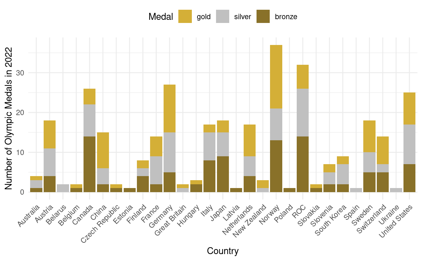
In the plot above, we've also relocated the legend to above the plot. For more details on adjustments we can make to bar plots, we can refer to the documentation for geom_bar() in ggplot2.
How to plot line graphs
There's one more very common plot type that we might useful. This one is a line graph, or line chart, and is very common when depicting data that changes with time. To see this, we'll return to our airquality.complete data, where we can plot a line graph with Day on the x-axis and Ozone on the y-axis. We'll do this by adding a geom_line() layer.
ggplot(airquality.complete, aes(x=Day, y=Ozone)) +
  geom_line()
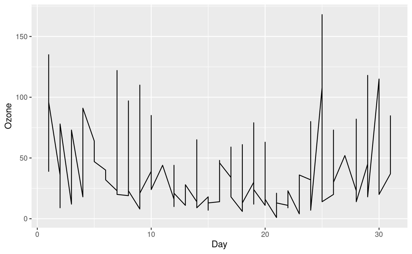
The figure above is confusing and doesn't seem to make much sense. That's because our airquality.complete data can potentially contain an Ozone level for each Day in each of the five months in Month!
How to plot multiple lines in a single plot
Connecting all these points does not make much sense so let's split these out by Month. We can do this by specifying group=Month inside the aes() mapping. To make these lines easier to see, we'll additionally color them by month via colour=Month inside the aes() mapping.
ggplot(airquality.complete, aes(x=Day, y=Ozone, group=Month, colour=Month)) +
  geom_line()
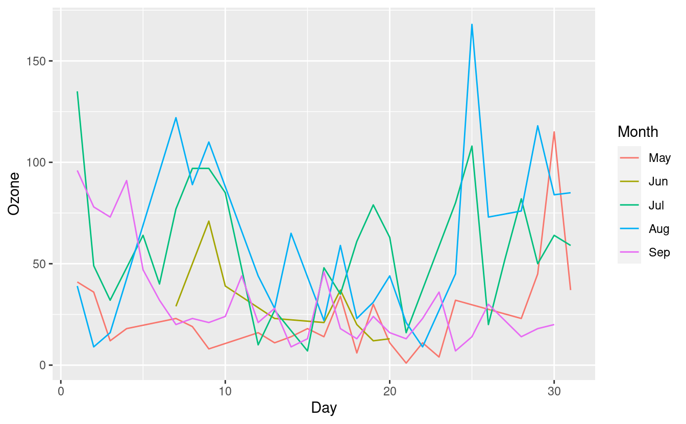
This new plot shows the Ozone levels for each Day, with a separate line for each Month. The five lines for the five months overlap quite a bit, however, so it's still a little difficult to distinguish them.
To depict this information even more clearly, we can split out the line graphs by Month onto separate panels.
How to plot multiple plots in one plot with facets
To split the line graphs by Month onto separate panels, we can add a facet_grid() layer. Inside this layer, we specify .~Month to indicate that we want to split the panels based on Month along the y-axis. If we additionally wanted to split the panels by a second factor variable, we could do that by specifying the variable name in place of . in .~Month.
ggplot(airquality.complete, aes(x=Day, y=Ozone, group=Month, colour=Month)) +
  geom_line() +
  facet_grid(.~Month) +
  theme_bw()
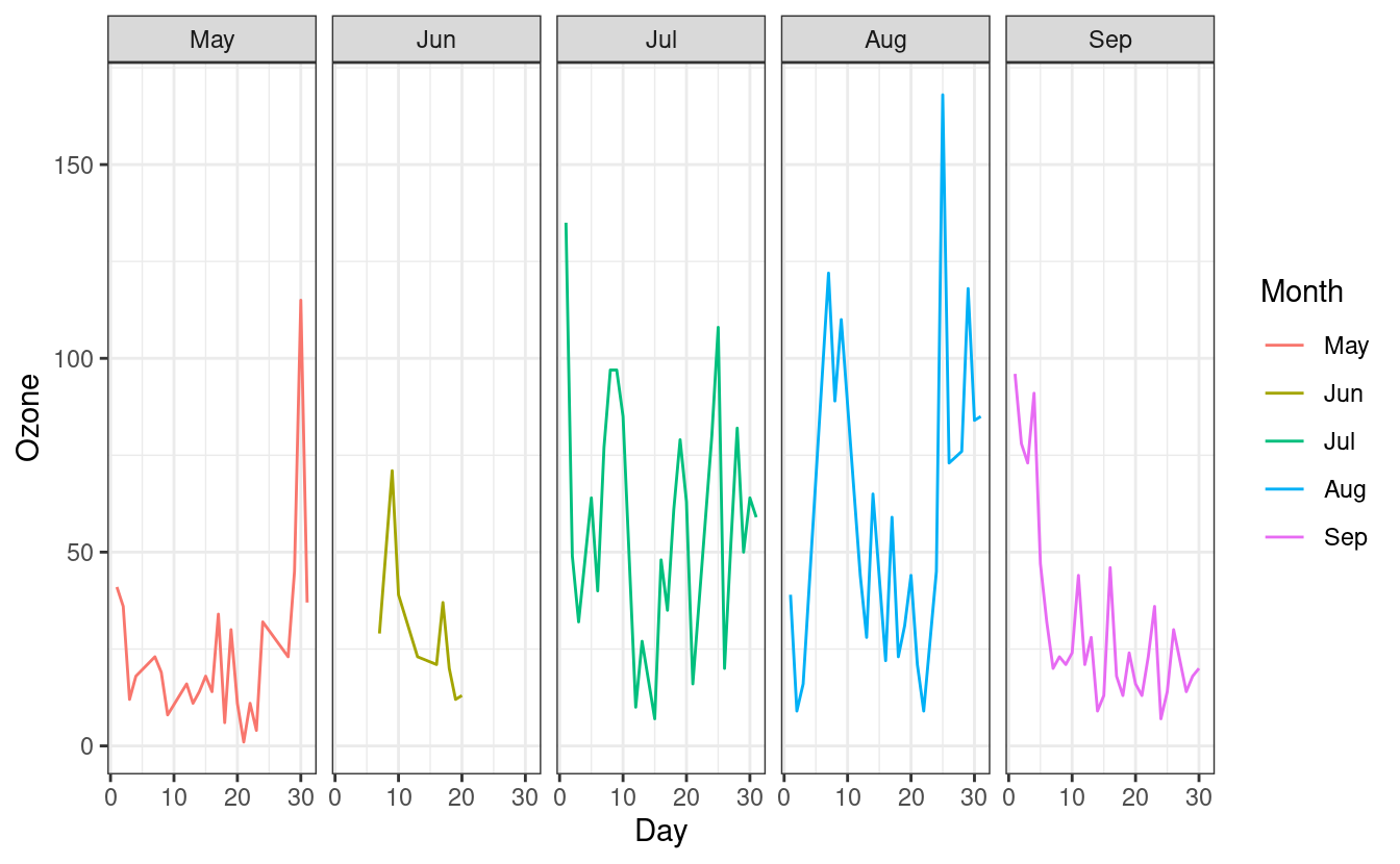
Since the facets are automatically labeled with the month names, our legend for the Month colors is now redundant. As we did in Part 1, we can remove the legend by adding a theme(legend.position = "none") layer after the theme_minimal() layer.
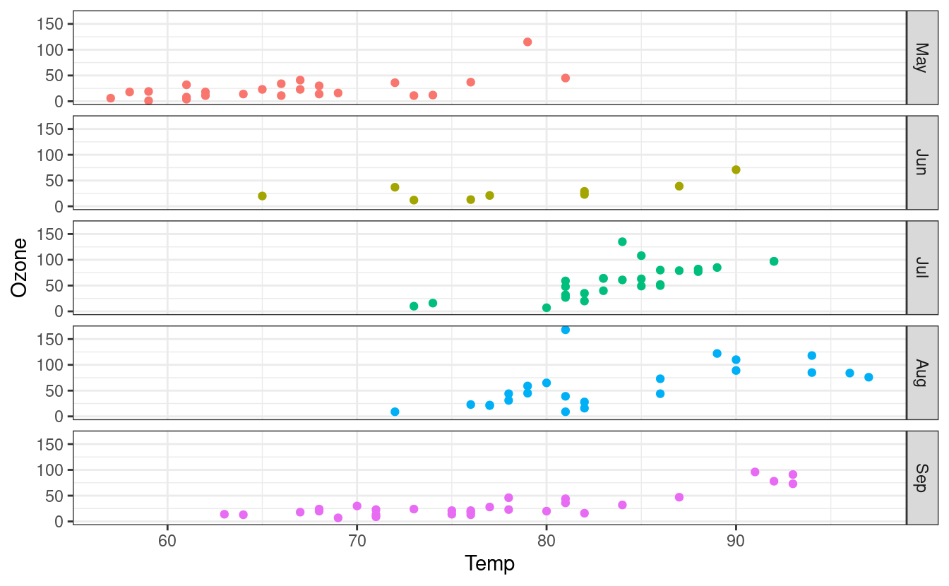
We can also switch to plotting points instead of lines by swapping to the geom_point() layer. Finally, we can swap the facet orientation to see what the plot looks like when we split the panels along the other axis.
ggplot(airquality.complete, aes(x=Temp, y=Ozone, group=Month, colour=Month)) +
  geom_point() +
  facet_grid(Month~.) +
  theme_bw() +
  theme(legend.position = "none")
How to save plots to files
We covered a lot of different plot types in this post! Let's wrap up by looking at how to save these plots to files. There are a number of ways to do this. For now, we'll use the ggsave() function from the ggplot2 package.
A quick look at the ggsave() documentation via ?ggsave shows us that at a minimum, we need to specify a file name for the saved plot. If we don't specify a plot object, such as p above, ggsave() will default to saving the last plot we made.
ggsave("myplot.png")
Other parameters to alter when saving plots as files
The ggsave documentation also shows us that we can specify different file types including eps, ps, pdf, jpeg, tiff, and png via the device input. Additionally, we can also specify the width and height of our exported file.
If we want to save to a particular directory, we can specify that with the path input. If we don't specify path, ggsave() will default to saving the plot in the current working directory. We can locate our current working directory by typing getwd() into the R console. Finally, if we plan to use the saved plot for publication, we can also specify the resolution we need with the dpi input.
Great job!

That was a lot of material we just covered! We learned how to overlay smooth lines on scatterplots. We also learned how to plot histograms, boxplots, bar plots, and line graphs. Finally, we went over facets and how we can use them to plot multiple plots in a single plot, and how to save our plots to files.
Now that we're pretty comfortable with the basics of making data visualizations in R with ggplot2, we'll move onto a code lab on exploratory data analysis! In our next post, we'll practice and explore the things we learned in this tutorial with a code lab!